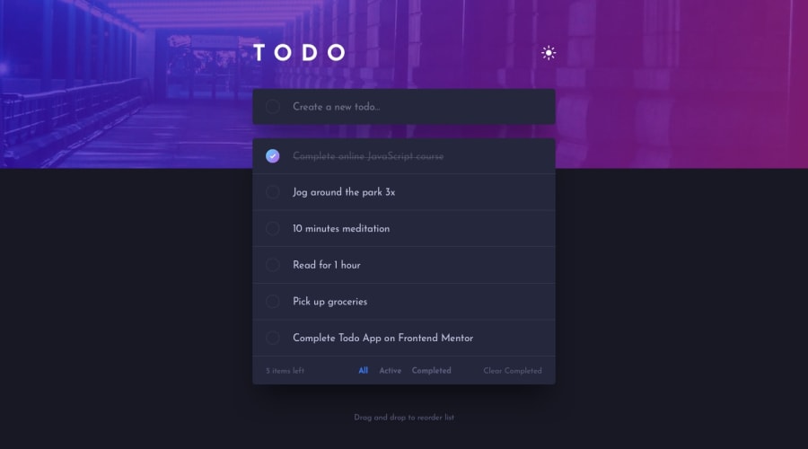
Design comparison
SolutionDesign
Community feedback
- @niemalPosted about 2 years ago
Hello there,
Just want to note that in the mobile version the cross icon does nothing (is supposed to remove the entry).
Looks decent btw!
1@rbrecknerPosted about 2 years agoHi @niemal, thank you, now it works! It was also not doing the thing on the desktop version, as I thought it was indicating task completion, but removing makes much more sense.
0
Please log in to post a comment
Log in with GitHubJoin our Discord community
Join thousands of Frontend Mentor community members taking the challenges, sharing resources, helping each other, and chatting about all things front-end!
Join our Discord
