Huddle Single, CSS and HTML (Desktop first, Mob second)


Design comparison

Solution retrospective
First attempt at anything like this.
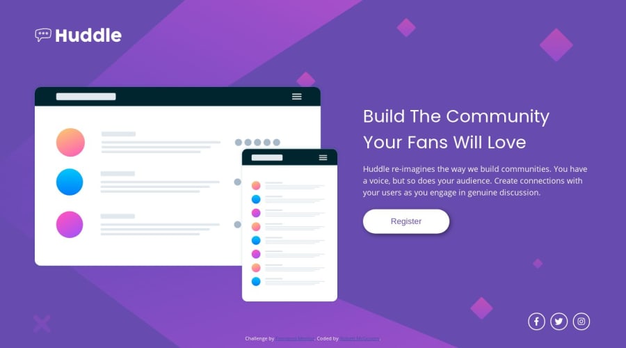
Spent far too long using diffchecker to compare the design image and an output grab from chrome. You can see mob-img-diff-1.png & img-diff-2-desktop-near-enough.png in the work-through directory in the repo to see how close I ended up (there is some mild diff because of the image quality, the illustration mockup has slight diff colors in it, likewise the background)
With positioning like this, is it better to use %, rem, or px?
I tried using 700 weight for the header "Build the ...." but it never looked right. Nor does 400 but it's close enough. What should have it been?
How best to get the fontbook-awesome images more central in the circles?
How close should I be looking to get?
Community feedback
Please log in to post a comment
Log in with GitHubJoin our Discord community
Join thousands of Frontend Mentor community members taking the challenges, sharing resources, helping each other, and chatting about all things front-end!
Join our Discord