Submitted 4 months ago
huddle-landing-page-with-single-introductory-section-master

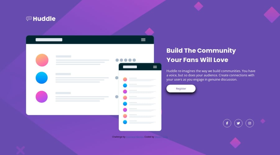
@manjirigole

Design comparison
SolutionDesign

Community feedback
- @hitmorecodePosted 4 months ago
Nice looks good, well done. Just a few things
- The shadow on the button is just to strong, make it softer. Change the opacity or change to a much lighter gray.
- There should be some hover animation over the social media links.
- When switching to small screen size the background image changes also.
Marked as helpful0

Please log in to post a comment
Log in with GitHubJoin our Discord community
Join thousands of Frontend Mentor community members taking the challenges, sharing resources, helping each other, and chatting about all things front-end!
Join our Discord