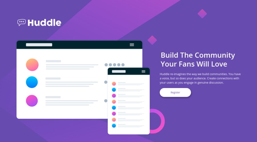
Design comparison
Solution retrospective
This was my last free newbie challenge. I am happy finished newbie section.
Also i have a question: in this challenge i could not do background image pixel perfect. Could you any suggestions?
Community feedback
- @emestabilloPosted almost 4 years ago
Hi @mesutcifci, good job! I think the background looks ok, was it the pink ring on desktop? You could try placing the mockup-screens image in front of it to hide it. The elements look a little small to me in medium widths. There's enough space for them to scale and fill more of the screen, rather than constraining them to mobile design. It would also be good to keep the hover states consistent on all screen widths. Hope this helps!
3 - @ApplePieGiraffePosted almost 4 years ago
Hello, Mesut Çifci! 👋
Nice to see you complete another challenge! 😀 Well done on this one! 👍
If you use Chrome, consider looking into the PerfectPixel browser extension. It allows you to overlay images over your website in the browser so that you can see exactly how your solution matches up with the original design. 😉
Keep coding (and happy coding, too)! 😁
1
Please log in to post a comment
Log in with GitHubJoin our Discord community
Join thousands of Frontend Mentor community members taking the challenges, sharing resources, helping each other, and chatting about all things front-end!
Join our Discord
