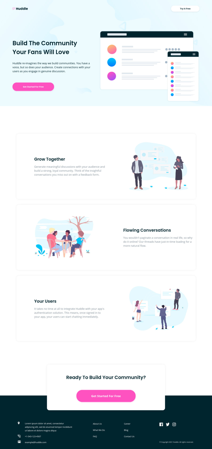
Huddle landing page with alternating blocks - HTML&CSS - with flexbox
Design comparison
Solution retrospective
Overall pretty happy with the result. It's responsive from mobile up to desktop view with intermediate layouts.
Community feedback
- @ChamuMutezvaPosted about 3 years ago
Nice work.
- on
div class="useful-links">
, if there are links , then thea
element has to be used as a child of theli
element. The same should also apply on<div class="social-media-links">
0@chillcodemaoPosted about 3 years ago@ChamuMutezva hi Chamu, nice to meet you. Thank you for your time and feedback. Indeed your feedback is precisely on point. To be honest, I haven't written the ul.li.a code as there are no actual links leading somewhere and so for the purpose of the exercise I just used the li element for hover, focus, styling.
0 - on
- @dusanlukic404Posted about 3 years ago
Hey Alex, very good job. Well done!
You only forget to add transition property on buttons for making smooth hover effect and also add white logo on footer.
0@chillcodemaoPosted about 3 years ago@dusanlukic404 hi Dusan, nice to meet you. Thank you for takin the time to review my solution. Actually, everything has transitions, it's just 0.25s (as there was no instruction, I usually to a .25s for transitions for buttons and stuff like that). The "Huddle" logo in the footer is white and visible on Chrome but I noticed that Firefox has an issue with it. It's because I've used the filter property to make it white. I could have done it in a few different ways as I've noticed "filter" is not fully supported on all browsers and sometimes doesn't display properly.
0
Please log in to post a comment
Log in with GitHubJoin our Discord community
Join thousands of Frontend Mentor community members taking the challenges, sharing resources, helping each other, and chatting about all things front-end!
Join our Discord