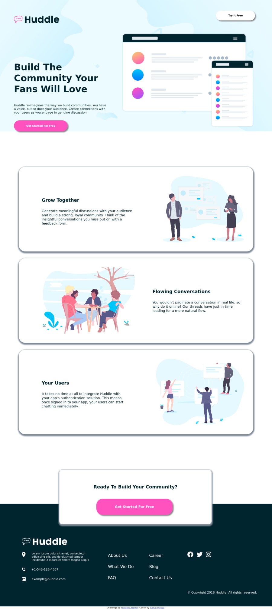
Huddle landing page with Alt. feature blocks | Responsive | HTML CSS
Design comparison
Solution retrospective
A very Happy New Year 2022 everyone 😄😄😄
This is my 1st project of the year.
It was a perfect challenge to practice layout skills, indeed! I enjoyed coding media query part the most.
As always, I'd really appreciate if you could answer the following:
What did I do wrong? What did I do right? How can I improve?
Thanks in advance 😄 Happy Coding😄
Community feedback
- P@remusbuhaianuPosted over 3 years ago
Congrats on completing the challenge, @itush!
I had a look through your final solution and code. Here are a few suggestions / observations that I hope will be useful to you:
-
You shouldn't set a fixed width directly on the body element
-
Your responsive design needs to be optimized a bit. There's horizontal scrolling on smaller screens and parts of your layout aren't centered
-
Excessive box-shadow. It should be soft and subtle
-
Improve the readability of your HTML code. Format your code better and use more meaningful class names. As a developer, you need to learn how to write code that reads like prose.
-
Your media queries are too convoluted. Try to simplify it. Here's a video that might help you https://www.youtube.com/watch?v=VsNAuGkCpQU&ab_channel=KevinPowell
Hope my points will prove useful to you.
Keep up the good work and looking forward to seeing more of your work here!
Marked as helpful1@itushPosted over 3 years ago@Remus432 Thank you very much for the suggestions🙏. It was insightful. I'm always ready to unlearn the wrong approach and learn the right one.
1.Setting a fixed width directly on the body element In my initial solutions I didn't do that. In "Design Comparison" my old solutions looked very different, in terms of size. But ever since I started setting fixed width the "Design Comparison" improved.
If I shouldn't set a fixed width directly on the body element where should I set it? What are the pros and cons of doing that? What is the best way to do it, when the designs were created to the following widths Mobile: 375px, Desktop: 1440px?
2.Readability of HTML Code
.hdr = header, .btm = bottom, #tif= Try It Free, #btmart2 = bottom article 2, .yu=Your Users...😄😄😄 I prefer to use fewer characters when it comes to class/id name and they might be entirely meaningless for others. On the other hand, class names like .top .topleft .topright .middle I think are not so difficult. However, I'll certainly be more creative while naming classes with better names and write code that reads like prose from now on.3.The box-shadow issue is now fixed.
4. Responsive Design I agree. It could have been better. Honestly I got little tired in some of the parts, yet I finished it.
5. Convoluted media queries I'm also less satisfied with my media query block. I was looking for resources that'll specifically help me to reinforce my responsive designing skills. Thank you very much for sharing the video. I'm optimistic about implementing the lessons in my future projects.
6.What did I do right? I'd highly appreciate If you could highlight couple of things that I did not do wrong. Sharing suggestions/ feedbacks is a great work.
Happy to connect. Happy Coding😄
0 -
Please log in to post a comment
Log in with GitHubJoin our Discord community
Join thousands of Frontend Mentor community members taking the challenges, sharing resources, helping each other, and chatting about all things front-end!
Join our Discord
