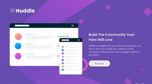
Submitted almost 3 years agoA solution to the Huddle landing page with a single introductory section challenge
huddle landing page with single introductory section, responsive
bem, sass/scss
@AlanLopRey

Solution retrospective
I had a lot of difficulties when making the navigation icons, I couldn't make them look like in the challenge but I still did the best I could, if anyone knows how I could improve or if you have articles that have studied them I would appreciate it.
Code
Loading...
Please log in to post a comment
Log in with GitHubCommunity feedback
No feedback yet. Be the first to give feedback on Alan Lopez Reyna's solution.
Join our Discord community
Join thousands of Frontend Mentor community members taking the challenges, sharing resources, helping each other, and chatting about all things front-end!
Join our Discord