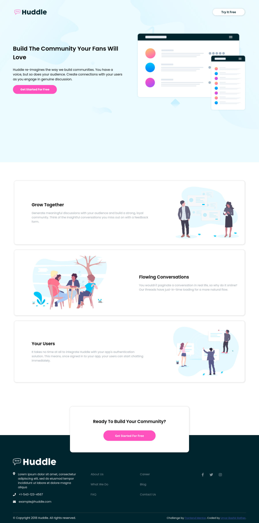
Huddle Landing Page Using Pure HTML and CSS
Design comparison
Solution retrospective
Hi Everyone! Hope you will like my work. Please do write your feedback about my work. Every single feedback will help me alot. Thanks
Community feedback
- @ApplePieGiraffePosted over 4 years ago
Hey, good work on this challenge, Umar Bashir Rather! 👍
Your solution looks good and is responsive! 🙌
I suggest,
- Centering the content of the page (and allowing the backgrounds of the header and footer to occupy the full width of the screen) even on screens with large widths. Currently, the content of the page simply sticks to the left of the page when the screen width increases above 1440px.
Keep coding (and happy coding, too)! 😁
3@umarbashirrPosted over 4 years ago@ApplePieGiraffe Thanks for suggestions. It really help me a lot to understand my small mistakes that I have made. My every small mistake is making me even better day by day.
0 - @grace-snowPosted over 4 years ago
Hi Umar,
You have a few accessibility issues that need addressing with this
- Look up how to write meaningful alt text on images. From reading the html, I should be able to understand what the images are if they have alt text, but things like
alt="Flowing Conversation"doesn't describe it in a meaningful way - Make sure you include aria-label or some hidden content to say where your social media links are going
As already stated above, you need to account for large screens in your layout too. I would create a
.wrapperclass to limit the width and center content on the pagemax-width: 1440px; margin-right: auto; margin-left: auto;and place that on individual elements as needed (you would need to add some divs with that wrapper class just for layout).If you want a neat trick to break elements out of their container, check out https://piccalil.li/tutorial/creating-a-full-bleed-css-utility/
Other than that, really good use of semantic html. You should be pleased with this :)
2@umarbashirrPosted over 4 years ago@grace-snow Thanks for your valuable feedback. It really help me a lot to understand that where I am doing mistake and all these small things really making me more confident about my code. I will definitely update all the above mentioned points.
1 - Look up how to write meaningful alt text on images. From reading the html, I should be able to understand what the images are if they have alt text, but things like
- @Greeshma2903Posted over 4 years ago
Good one!
keep going!!
1
Please log in to post a comment
Log in with GitHubJoin our Discord community
Join thousands of Frontend Mentor community members taking the challenges, sharing resources, helping each other, and chatting about all things front-end!
Join our Discord
