

Design comparison

Solution retrospective
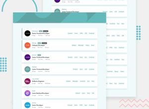
Please feel free to give your feedback as this is my first ever webpage.
Community feedback
- @emestabilloPosted over 4 years ago
Hi @ronakagarwal3434 , awesome job with this project! Filtering works really well. Just a few things I noted design-wise:
- The font for
.word1and.word3seems to be off - Box-shadow is a little heavy
- Cards could use more spacing between them. Same with their
border-radiusproperty, there's none on the right and needs more on the left
Hope this helps :-)
1@ronakagarwal3434Posted over 4 years ago@emestabillo Thanks for your feedback. It was pleasant to know my mistakes. I have changed the things which you have told me to change. Please check the solution again and let me know if any more changes are required.
1@emestabilloPosted over 4 years ago@ronakagarwal3434 Looking good! Much closer to the design :-) The one thing that remains is the font change.
1@ronakagarwal3434Posted about 4 years ago@emestabillo Yes , I will look for improvement ... Thanks for your honest feedback 🙂
0 - The font for

Please log in to post a comment
Log in with GitHubJoin our Discord community
Join thousands of Frontend Mentor community members taking the challenges, sharing resources, helping each other, and chatting about all things front-end!
Join our Discord