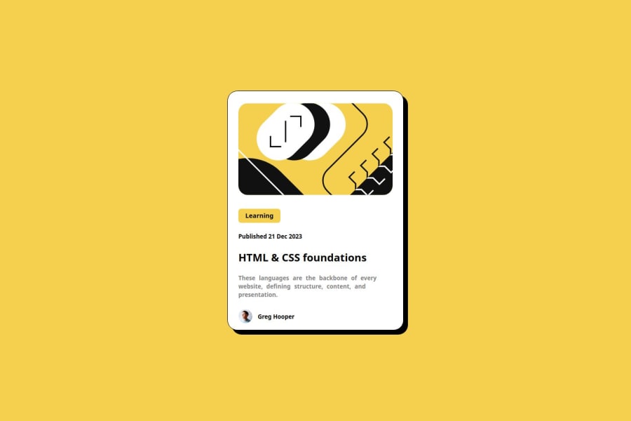


Design comparison

Solution retrospective
I am mostly proud of my website because I manage to position every element in correct place
What challenges did you encounter, and how did you overcome them?Positioning was the biggest challenge and i was just trying multiple times to find a solution
What specific areas of your project would you like help with?I dont know if my method of positioning things like divs and text is correct because i mostly use padding to achieve height and then I am trying to move it left and right with centerings or text-align and this is only method that i know and it worked on my website
Community feedback
- P@StroudyPosted 7 months ago
Hello again, Fantastic effort on this! You’re really nailing it. Just a few things I noticed that could make it even better…
-
Having a clear and descriptive
alttext for images is important because it helps people who use screen readers understand the content, making your site more accessible. It also improves SEO, as search engines usealttext to understand the image's context, helping your site rank better, Check this out Write helpful Alt Text to describe images, -
Your heading elements
<h5><h2>, Heading elements should be in sequentially-descending order (e.g.,<h1>,<h2>,<h3>) to create a clear content structure, improving accessibility and SEO. Skipping levels or using them out of order can confuse screen readers, affect search engine rankings, and make your content harder to understand. -
Line height is usually unitless to scale proportionally with the font size, keeping text readable across different devices. Best practice is to use a unitless value like
1.5for flexibility. Avoid using fixed units likepxor%, as they don't adapt well to changes in font size or layout. -
Using a full modern CSS reset is beneficial because it removes default browser styling, creating a consistent starting point for your design across all browsers. It helps avoid unexpected layout issues and makes your styles more predictable, ensuring a uniform appearance on different devices and platforms, check out this site for a Full modern reset
-
These
<div>should really have semantic tags like headings (<h1> to <h6>) and paragraphs (<p>) convey structure and meaning to content, improving accessibility, SEO, and readability by helping search engines and screen readers interpret the content.
        <div class="title">
          Learning
        </div>
I hope you found this advice helpful! Keep up the great work, You’re doing amazing, and I can’t wait to see what you create next. Happy coding! 🚀
Marked as helpful0P@miedzygalaktycznygitPosted 7 months ago@Stroudy Thank You. I really appreciate Your support and I can't wait to use this advice in my next projects.
1P@StroudyPosted 7 months agoHey @miedzygalaktycznygit, No problem, I will try to keep an eye out for it, You got this 💪
0 -
- P@defenstrationPosted 7 months ago
Your preview card looks pretty good. There are some small sizing differences, but overall it's close.
There are some things in the code that you might want to look at.
First, you want to get used to dropping your styling into a css file. It just makes it easier to review your code.
It's awesome that you are focusing on using reactive units! I have not seen them used the way that you are using them. In my understanding the typical rem is 16px. When you use tenths of an rem you get some strange fractions. .1rem is 1.6px. I don't know what kind of effect that has, but I have always used eights to do rem, where .125rem = 2px. Maybe someone on here with more knowledge can speak to the effects.
There are also some semantic HTML elements that I would look at. I use headings like the contents section in a book. H1 as the book title (this is also what screen readers look for to start the page), with h2 being the next level (sections) then h3 next (chapters) and so on. I'm still tweaking how I do this, but starting to think about them that way helped me start organizing my thought better about building.
I hope this helps. Stay awesome!
Marked as helpful0 - @Ethical-SaleemPosted 7 months ago
Kudo to a job weel done. You could try improving on the line-height of the description to make it look closer to that in the design
0


Please log in to post a comment
Log in with GitHub
Join our Discord community
Join thousands of Frontend Mentor community members taking the challenges, sharing resources, helping each other, and chatting about all things front-end!
Join our Discord