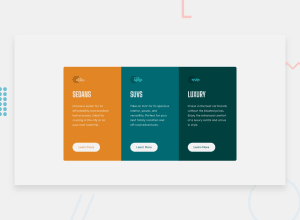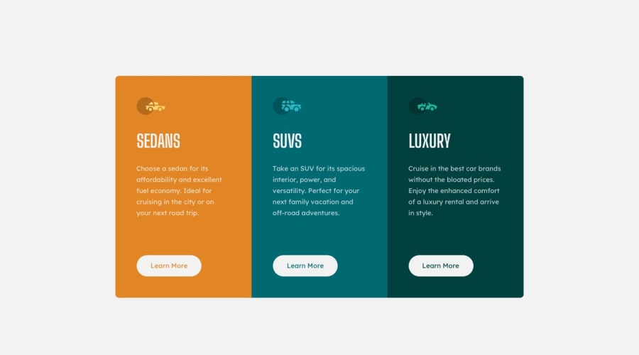
Design comparison
Solution retrospective
please don't hesitate to give me feedbacks and enhancements to improve my coding skills (especially on the responsivity). thank you in advance ♥.
Community feedback
- @pikapikamartPosted about 3 years ago
Hey, great job on this one. Layout in desktop is good and the mobile layout is good as well, just an idea for the mobile state, you could have made the cards more wider with a relative size so that it will scale along with the screen's size.
dewslyse already said great suggestions, just going to add some little ones:
- Since those car icons are just decorations, adding an
aria-hidden="true"attribute on thesvgwould be really great. - The
learn moreis more likely to be a anchor tagarather thanbutton, because it is like a link to "learn more" about the car.
Just those 2, great job again on this one.
Marked as helpful0@tarik310Posted about 3 years ago@pikamart thanks very much for the advices. with all respect
0 - Since those car icons are just decorations, adding an
- @dewslysePosted about 3 years ago
Nice work on this challenge. However, there are some few things to note:
- Your document is missing a major landmark element
main. Always remember to wrap the main / central content of your page in main. Changing your.container<div>to a<main>in your html would actually resolve all the accessibility issues raised. - Your page has more than one
h1(<h1>SEDANS</h1>,<h1>SUVS</h1>,<h1>LUXURY</h1>). Best practice dictates having one<h1>element on a page. You should change the currenth1s toh2s and add a screen-reader onlyh1element..
Happy coding!
Marked as helpful0@tarik310Posted about 3 years ago@dewslyse thanks very much for the advices. with all respect
0 - Your document is missing a major landmark element
Please log in to post a comment
Log in with GitHubJoin our Discord community
Join thousands of Frontend Mentor community members taking the challenges, sharing resources, helping each other, and chatting about all things front-end!
Join our Discord
