HTML5, CSS3, responsive design, Google fonts; meta viewport, class sel
Design comparison
Solution retrospective
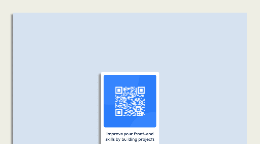
The design involves complex layout and positioning, which can be challenging to get right.
The position property is used extensively throughout the CSS, which can sometimes lead to unexpected behavior if not used carefully. The height of the .screen and .plate elements are set to fixed pixel values, which may not work well on all devices. The top and bottom properties are used to position some elements, which may not work as expected if the height of the parent container changes.
Community feedback
- @ecemgoPosted over 1 year ago
Some recommendations regarding your code could be of interest to you.
- In order to center the card easily and correctly, you can add flexbox and
min-height: 100vhto thebody - If you want, you can use the recommended color for the background:
body { margin: 0; display: flex; flex-direction: column; justify-content: center; align-items: center; min-height: 100vh; background-color: hsl(212, 45%, 89%); }- If you use flexbox, you don't need to give
margin,topto the.white-sectionin order to center the card because flexbox in thebodyalready provides it. - If you give the
max-width, the card will be responsive. - You can use
paddingfor the blank between the content and the border of the card.
.white-section { text-align: center; /* height: 486.6px; */ /* width: 25%; */ max-width: 300px; background-color: #ffffff; /* margin: auto; */ /* position: relative; */ /* top: 330px; */ border-radius: 10px; box-shadow: -10px 10px 8px #888888; padding: 20px 20px 30px; }- You don't need
.screenand.plate, you can delete them
/*
.screen {
    height: 1460px;
    width: 100%;
    background-color: #eeeee4;
    margin-top: 0;
}
*/
/* .plate { height: 1320px; width:90%; margin:auto; background-color: #d6e2f0; position:relative; top:70px; box-shadow: -10px 10px 8px #888888; } */- Finally, you can update
imgand.attributionin this way:
img {
  /* width: 90%; */
  width: 100%;
  border-radius: 10px;
  /* margin: 5%; */
}
.attribution { /* height: 30px; */ /* width: 100%; */ font-size: 11px; text-align: center; /* background-color: white; */ /* position: relative; */ /* top: 15px; */ }Hope I am helpful. :)
Marked as helpful0@NyayDGPosted over 1 year ago@ecemgo Thank you so much, I will make those changes.
0 - In order to center the card easily and correctly, you can add flexbox and
- @Bader-IdrisPosted over 1 year ago
You can set the container in the middle of the screen whatever user changes it when you add these properties to it in CSS:
.container {
  position: absolute;
  top:50%;
  left: 50%;
  transform: translate(-50%, -50%);
}
the new feature is transform, it has many lovely properties you can discover, I personally love it. Hope it's useful
Marked as helpful0@NyayDGPosted over 1 year ago@Bader-Idris Thank you so much, I will make those changes.
0 - @pperdanaPosted over 1 year ago
Hello there 👋. Congratulations on successfully completing the challenge! 🎉
- I have some additional recommendations for your code that I think you'll find interesting and valuable.
📌 Add
<main>tag as semantic HTML in code-
The
<main>tag is a semantic HTML element that is used to define the main content of a web page. -
The
<main>tag should be used to wrap the primary content of a web page, such as the main article, section, or body of text.
for example code:
<main>
  <div class='container'>
    <h1>Article Title</h1>
    <p>Article content goes here...</p>
    .......................
  </div>
</main>
In the example above, the
<main>tag is used to wrap the<div>tag, which contains the primary content of the web page. This tells both human readers and search engines that the content inside the<main>tag is the most important and relevant content on the page.I hope you found this helpful!
Happy coding🤖
0
Please log in to post a comment
Log in with GitHubJoin our Discord community
Join thousands of Frontend Mentor community members taking the challenges, sharing resources, helping each other, and chatting about all things front-end!
Join our Discord
