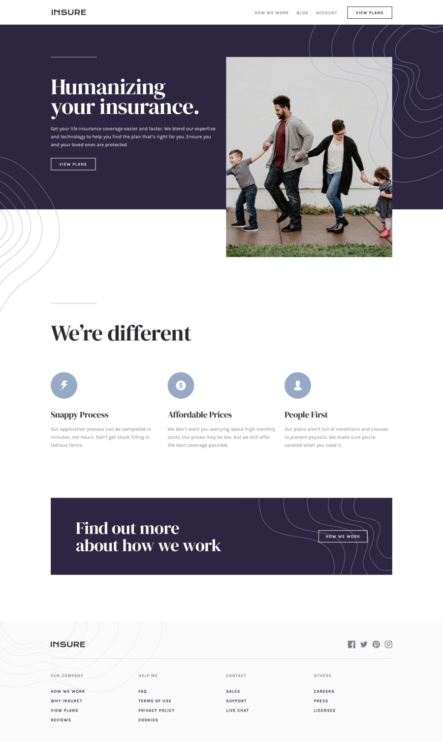
Design comparison
SolutionDesign
Solution retrospective
Hello everyone I hope you like my solution, I would be grateful if you could look at how I did it, comment and give some advice. Thank you :)
Community feedback
- @tedikoPosted over 3 years ago
Hello, Aleksandar! 👋 Well done on this challenge! Here's a few things I'd suggest you to take a look at:
- Change the
altattributes for the.logoand.cardimage, as they don't add any extra context for screen reader users. Since your images are decorative youralttext should be provided empty (alt="") so that they can be ignored by assistive technologies. - You made a typo in
#btnborderproperty. Change 1px sold #000 to 1px solid #000. - You doesn't change your
.humanizing imgto desktop version, it is still 'src="./images/image-intro-mobile.jpg` on desktop.
Keep up the good work! 💪
0 - Change the
Please log in to post a comment
Log in with GitHubJoin our Discord community
Join thousands of Frontend Mentor community members taking the challenges, sharing resources, helping each other, and chatting about all things front-end!
Join our Discord

