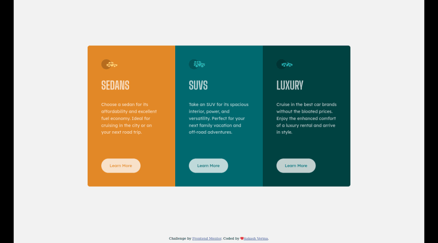
Design comparison
SolutionDesign
Solution retrospective
please give me feedback, I am newbie and want to improve my skills.
Community feedback
- @pikapikamartPosted about 3 years ago
Hey, great work on this one. Layout in desktop seems fine, but there is this black-space on both sides of the
bodytag. Layout in desktop have this as well, but the layout itself is fine.Some suggestions would be:
- Remove
background-colorin thehtmlelement. This what creates that black colored sides which is not really great to look at. - Avoid using multiple usage of
h1element. Always have at least only 1h1element. Those could have been replaced withh2. On this one, theh1would be a screen reader only text. Thish1would havesr-onlyas a class, this class is just a css stylings that is intended for screen reader users, you can search up the web for this styling and apply it in theh1element, along with the appropriate text inside it. - When using
altattribute, avoid adding words that relates to "graphic" like "logo, image, icon, picture..." as a value foraltattribute. Assistive tech will handle those for you. - The
learn moreshould have been usingatag. Since this is not aformbuttonare not used since there are no control it should do. - The
learn moreshould have a visual-indicator, right now, if you tab on them you won't see anything that will inform you that you are focusing on the. On their:focus-visibleadd anoutlineorbox-shadoworborder. Just an indicator.
Aside from those, great work.
Marked as helpful1 - Remove
- @skyv26Posted about 3 years ago
@pikamart Thank you so much.. I understand and always keep in mind.
0
Please log in to post a comment
Log in with GitHubJoin our Discord community
Join thousands of Frontend Mentor community members taking the challenges, sharing resources, helping each other, and chatting about all things front-end!
Join our Discord
