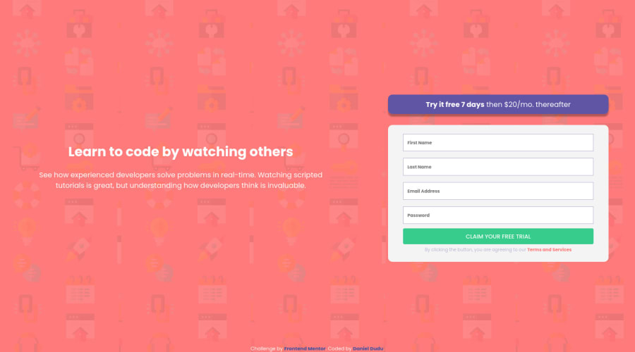
Design comparison
Solution retrospective
I have made this only with HTM5 & CSS3 and did not touch the JS part - because I am still beginner in this. Didn't want to copy / paste without learning first what I am doing.
If you feel like I could do better, I appreciate any comments :) Thank you !
Community feedback
- @grace-snowPosted over 3 years ago
Hi
This doesn't quite look like the design yet. It's not too far off, but try to get it exactly like the design at all screen sizes if you can. It's worth taking the extra time on these early challenges.
Good luck
Marked as helpful0@danielduduPosted over 3 years ago@grace-snow Thank you! - I have tweaked here and there, especially with media queries and max-width for the desktop view.
0 - @Akshita-Sharma-25Posted over 3 years ago
Great work! keep going ahead.
Marked as helpful0 - @Amanpatil-DevPosted over 3 years ago
Don't be discouraged Daniel 🖐️. You did an amazing job 👌 your solution responds well on Mobile and looks good just need to fix the width issue when going up 1440px.
But fixing it with required attribute really handles JS part correctly.
Keep learning 👍 You did great 👏
Marked as helpful0 - @danielduduPosted over 3 years ago
Thank you Aman! :) I have made some changes as you have noted about the width issue.
1
Please log in to post a comment
Log in with GitHubJoin our Discord community
Join thousands of Frontend Mentor community members taking the challenges, sharing resources, helping each other, and chatting about all things front-end!
Join our Discord