Design comparison
Solution retrospective
Hello folks
This challenge was pretty good and taught me a lot of stuffs
Making it's layout was really new and confusing for me...I had to learn from someone else's code...
Huge thanks to @ApplePieGiraffe solution that guided me to complete this challenge when I was on the verge of giving up...I always learn something from him..!
This was the first time I made a carousel and used gulp to compile Sass files instead of using live sass compiler...this is because I wanted to learn dart-sass which has the module features that fascinated me..!
The transitionend event was a life saver for me and helped me to make the interactive-animation that I envisioned...
Since we are here to help each other learning...
Please examine my live project and it's code...I made sure that the code is as readable and DRY as possible..
Thank you in advance..!
Community feedback
- @tedikoPosted almost 4 years ago
Hello, Roc Tanweer! 👋
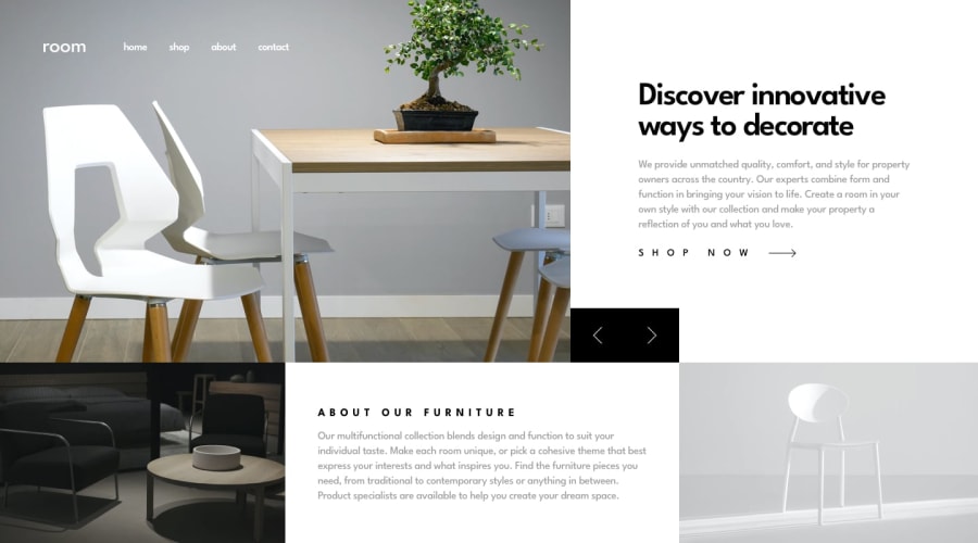
Congrats on finishing another challenge! 🎉 I really like the intro animation you added inspired by APG solution. It is actually really fits that design 😅 Your solution looks very good and also responds well, there is not much to say after APG great feedback but I'd suggest you to make your solution to take
100vhof height. This white space below doesn't seems right to me.Good luck with that, have fun coding! 💪
1 - @ApplePieGiraffePosted almost 4 years ago
Hello there, Roc Tanweer! 👋
It's nice to see you complete another challenge! 😀 And great job on this one! 👍 The intro animations that you added to the page look awesome (you and I are continuing the trend set by @zuolizhu 😆) and I really like the transition of the content of the page between slides! 🤩
It's also good to hear that you learned new things while working on this project and I'm glad you were able to learn a thing or two from my code! 😄
Just one or two small issues that I noticed—the "About our furniture" section could use a little more space around the text inside it when the width of the screen grows smaller (which can easily be added with some padding). And at times, some of the text content of the hidden slides peeks through and can be seen when resizing the screen from desktop to mobile. You might want to double-check the layout there! 😉
Otherwise, nice work, once again! Keep it up! 👏
Of course—keep coding (and happy coding, too)! 😁
1@ApplePieGiraffePosted almost 4 years ago@ApplePieGiraffe
Oh, yes, and the animation of the hamburger menu in the mobile layout is pretty cool—I was actually just thinking of doing the same thing for a hamburger menu in one of my upcoming projects! 😀
0@RocTanweerPosted almost 4 years ago@ApplePieGiraffe I am really glad you like hamburger menu animation
Could you explain the HTML issue I have ? I cannot understand that 🙏
1@ApplePieGiraffePosted almost 4 years ago@RocTanweer
Sorry if I didn't explain it well—it's just that if I resize my browser window to make it smaller and the layout of the page changes from desktop to mobile, it looks like the slider text is stuck between two states (as if it paused in the middle of a transition). Here's a screenshot of the issue.
0 - P@palgrammingPosted almost 4 years ago
🌟🌟🌟🌟🌟 great job.... it looks great
1
Please log in to post a comment
Log in with GitHubJoin our Discord community
Join thousands of Frontend Mentor community members taking the challenges, sharing resources, helping each other, and chatting about all things front-end!
Join our Discord
