

Design comparison
SolutionDesign

Community feedback
- @zlowramPosted about 2 months ago
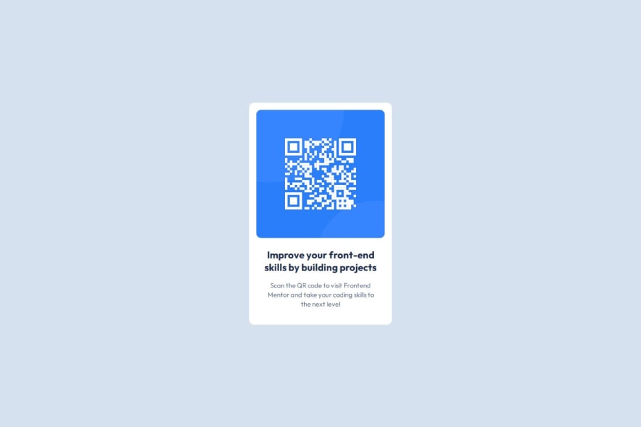
The solution looks good. At a visual level, being picky, I notice the following differences:
- The card seems a bit thinner than the one in the design
- The vertices of the card a little less rounded
Marked as helpful0

Please log in to post a comment
Log in with GitHubJoin our Discord community
Join thousands of Frontend Mentor community members taking the challenges, sharing resources, helping each other, and chatting about all things front-end!
Join our Discord