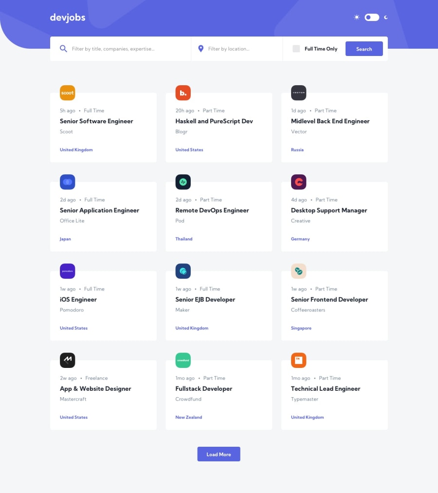
Design comparison
Solution retrospective
Your feedback is always welcome. I will continue to refactor and improve the app.
Community feedback
- @DEmanderbagPosted over 3 years ago
Hey Hadi,
Your solution looks great, I like the way how you are showing that the data is loading. And the website seems to respond quickly, but here is what I would change:
-
I would personally make full job card clickable and I would remove that default underline on the "a" tag.
-
You also have two items with the same id tag, in this case, id="full-time-only" the id element should be a unique element on the page and there should be only one id selector for the same name on the page. In this case, I would suggest changing to a class of "full-time-only"
Keep on Coding!! ^^
1 -
Please log in to post a comment
Log in with GitHubJoin our Discord community
Join thousands of Frontend Mentor community members taking the challenges, sharing resources, helping each other, and chatting about all things front-end!
Join our Discord
