Design comparison
Solution retrospective
Hello , I would appreciate your comments marking the things that can improve and correct errors, thanks :D.
Community feedback
- @emestabilloPosted over 3 years ago
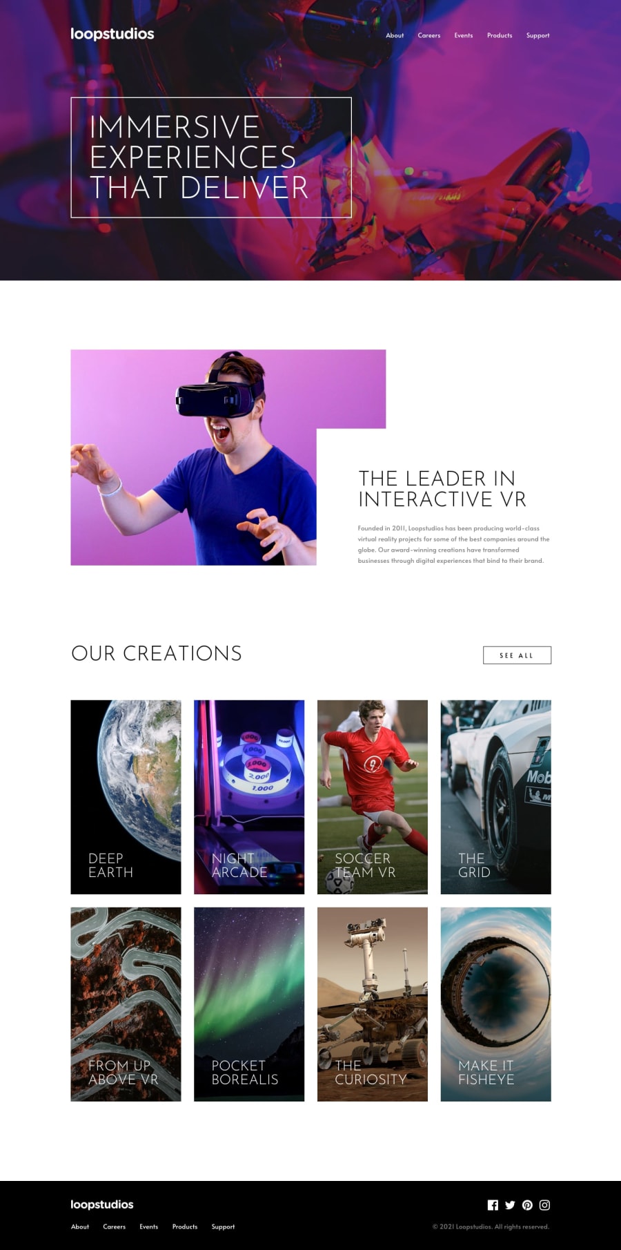
Hey Renzo, looks close to the design, congrats!
-
To get it closer still: the header image and the text inside the gallery section are missing the dark gradient that makes the text pop out. You'll see it if you look at the screenshot comparison.
-
Mobile toggle button should be a
buttoninstead of div -
I also noticed that you used a lot of px units. It's recommended to use scalable, relative units such as rem or em for accessibility
-
There are no hover effects on the footer, which I find odd since the rest of the interactive elements have it
-
There are items to address in the accessibility report
Hope this helps!
Marked as helpful0@ralvarezrenzoPosted over 3 years ago@emestabillo Right now I will try to fix all the parts that you mentioned and I will start to investigate about the px em rem that I see that is very important, you are pleased to take your time you help me a lot to improve , thank you very much :D !
1 -
- @palgrammingPosted over 3 years ago
Everything looks really good. Popup menu is good and everything looks like it is where it belongs ⭐⭐⭐⭐⭐
Marked as helpful0
Please log in to post a comment
Log in with GitHubJoin our Discord community
Join thousands of Frontend Mentor community members taking the challenges, sharing resources, helping each other, and chatting about all things front-end!
Join our Discord
