HTML, CSS, JavaScript and API
Design comparison
Community feedback
- @Sdann26Posted almost 3 years ago
Hi Michael!
Hi
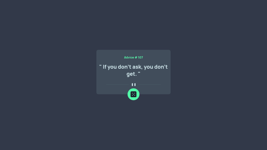
Congratulations for finishing the challenge, personally in this type of projects I recommend not to put height so that the box adapts to the size of the text. I would make the following changes, for example:
To the
.containerclass I would remove the height for both its mobile and desktop size.To the image with the class
.dividerI would give the following margin so that it does not have the button glued.margin-top: 2rem; margin: 2rem 0 2.8rem 0;Then you decide if you want to change the spacing in the media querie for mobile.
Maybe I would give
.containermore padding on the sides so that it can have more space for the text.Leaving aside the design what you should change for the frontend mentor generated report is
<div class="wrapper">to<main class="wrapper">the idea behind this is that <main> is a semantic and necessary tag that always goes inside the body because it contains the main content of the page.Lastly change the h3 to h1, this is mostly because there should always be a h1 per page in your project and in this case it is missing.
1@Blazing-MikePosted almost 3 years ago@Sdann26
Thanks for the review I would do that
1
Please log in to post a comment
Log in with GitHubJoin our Discord community
Join thousands of Frontend Mentor community members taking the challenges, sharing resources, helping each other, and chatting about all things front-end!
Join our Discord
