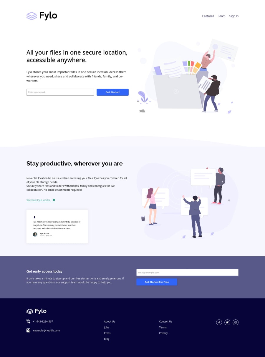
HTML, CSS, CSS Variables and Flexbox and Javascript
Design comparison
Solution retrospective
Any feedback would be appreciated.
Community feedback
- @elroytoscanoPosted about 3 years ago
Hey David, for the buttons, when you're hovering over them, you could use cursor:pointer in your css. Other than that, you've done a great job.
Marked as helpful0@brodiewebdtPosted about 3 years ago@elroytoscano I missed that too? Thanks. I will fix that.
Updated site. Thanks again.
0 - @skyv26Posted about 3 years ago
Hi! David, I hope you are well and good, Merry Christmas to you. I just checked your work. I noticed some minor issues.
-
I tried to enter
sdfdf@ssfin your email field and as I try to submit then your get started button height changed . -
In your second last section I also tried there to enter above string and again your second last container height increased.
Rest everything looks fine. I liked your smooth scrolling effect from bottom to top when click on social network icon. Overall good work.
Best wishes for you!
Marked as helpful0 -
- @brodiewebdtPosted about 3 years ago
Yes, I noticed that after I uploaded it to Netlify. That is because of the error message showing up when The email isn't right. I will have to think on it and fix it. Thanks for looking at it. Happy Holidays to you too.
Updated the form button on the site.
1
Please log in to post a comment
Log in with GitHubJoin our Discord community
Join thousands of Frontend Mentor community members taking the challenges, sharing resources, helping each other, and chatting about all things front-end!
Join our Discord
