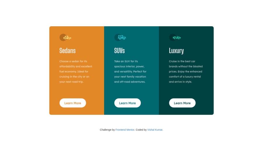
Design comparison
Solution retrospective
I have made a few changes as per suggestions. This is an improved version, if I can add something more please suggest. Thank You
Community feedback
- @darryncodesPosted about 3 years ago
Hi Vishal,
Good job completing this one, pretty much a perfect match!
- I like to add
transition: ease-in .3s;to the button so the hover affect is less abrupt. - you could clear up your accessibility report if you change
<div class="container">to<main class="container">and<footer class="attribution">. Semantic html is a really important concept - usually design should only have one
<h1>per the page admittedly this design doesn't really lend itself to that. Here is some more info anyway
All the best!
Marked as helpful0@LahsivK4070Posted about 3 years ago@darryncodes Thank you for your suggestion. I made a few improvements in the project as per the suggestions.
link: https://lahsivk4070.github.io/3-column-desingn1/ repo : https://github.com/LahsivK4070/3-column-desingn1
0 - I like to add
- @Dharmik48Posted about 3 years ago
Hey👋,
There's an issue of white space in you cards, there is a lot of padding/margin in the cards and it doesn't look good! So decrease it a bit.
Marked as helpful0@LahsivK4070Posted about 3 years ago@Dharmik48 I followed you suggestion and improved my design.This it how it looks now link : https://lahsivk4070.github.io/3-column-desingn1/ repo link : https://github.com/LahsivK4070/3-column-desingn1 Thank You.
0
Please log in to post a comment
Log in with GitHubJoin our Discord community
Join thousands of Frontend Mentor community members taking the challenges, sharing resources, helping each other, and chatting about all things front-end!
Join our Discord
