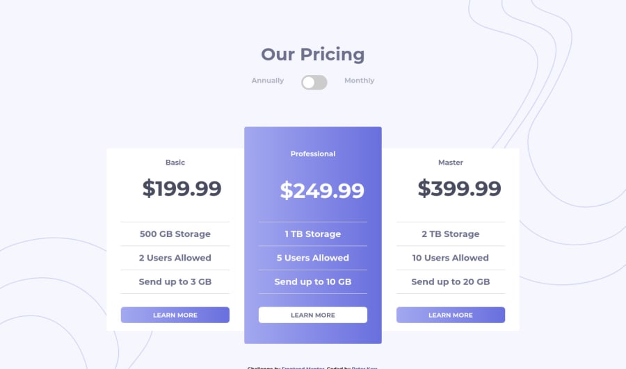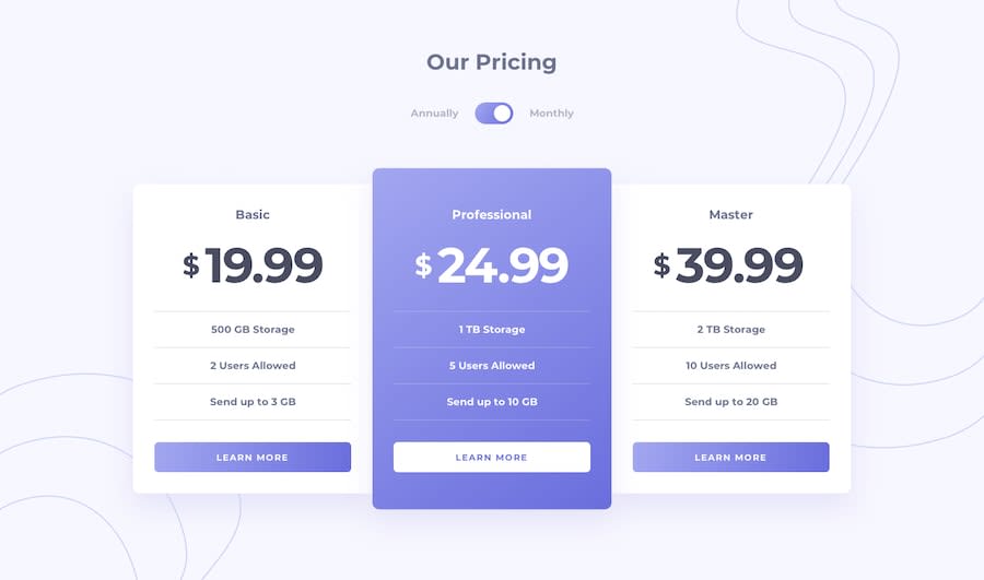
Design comparison
Solution retrospective
Feel this is pretty close, quite happy with it, only small differences I can spot like the size of the $. Feedback appreciated
Community feedback
- @JunjiequanPosted almost 4 years ago
Hi pete,
If I may, I would love to suggest you to focus on tablet responsiveness as well :)
0@petewkPosted almost 4 years ago@a331998513
Yep definitely makes sense, it hasn't been in any of the specs for the challenges I've done so which is why I've left it out, but worth doing.
Thanks!
0 - @RayaneBengaouiPosted almost 4 years ago
Hello Pete,
Congrats for completing the challenge ! 🙂
I'd like to suggest :
-
Add
cursor: pointerto your buttons so they look clickable. -
Adding the
box-shadowproperty to your cards to create an effect of depth.
Overall, well done for the challenge and happy coding ! 😃
0@petewkPosted almost 4 years ago@RayaneBengaoui Hi,
Yeah great suggestion, thanks for that, I'll use that from now on in solutions with buttons in them.
Cheers
0 -
Please log in to post a comment
Log in with GitHubJoin our Discord community
Join thousands of Frontend Mentor community members taking the challenges, sharing resources, helping each other, and chatting about all things front-end!
Join our Discord
