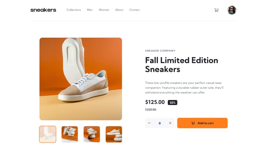
Design comparison
Solution retrospective
Hello, if you are reading this, kindly share a few things that I could do to improve this project, thank you.
Community feedback
- @AJBrownsonPosted almost 3 years ago
You did pretty good @Anthonypmarcel
The guy above has pretty much said everything but some things remain for you to do to clear all those accessibility issues.
Don't leave your href tag blank. You have to put in some text e.g. in the case of the Collections link, you can put in something like www.e-commerce.com/collections. Do this for all your links.
It's very important for your webpage to have a H1 tag. Change your H6 tag to H1 and you can style it to look smaller if you want but just make it a H1 tag.
I hope that this helps to clear all those accessibility issues.
Good Luck.
Marked as helpful1@anthonynwaweruPosted almost 3 years ago@AJBrownson thank you, will definitely work on the href and h1 correction.
0 - @correlucasPosted about 2 years ago
👾Hello Anthony Waweru, Congratulations on completing this challenge!
I saw your preview site and I liked a lot the work you’ve done here, it's almost complete, I’ve some suggestions you can consider applying to your code:
Make the menu hover smoother with
transition: ease-out 0.5s;.navlink:hover { color: #1d2026; border-bottom: solid 4px #ff7e1b; padding-bottom: 45px; transition: ease-out 0.5s; }Make the content centered removing these paddings:
#section--0 {
    /* position: relative; */
    /* height: 100vh; */
    /* padding-top: 23px; */
    /* padding-bottom: 132px; */
    background: rgba(255, 255, 255, 1);
}
And align the rest with
min-height: 100vhand useflexbox:body { min-height: 100vh; font-family: 'kumbh sans', sans-serif; font-size: 16px; display: flex; align-items: center; justify-content: center; }✌️ I hope this helps you and happy coding!
Marked as helpful0@anthonynwaweruPosted about 2 years ago@correlucas Thank you Lucas, implemented, have a look at it and let me know what you think 😁
0 - @skyv26Posted almost 3 years ago
Hi! Anthony, Congrats man, you did it whenever I see this project posted by developer then It reminds me, How I completed this one. So I saw your work and I would say good , even it is pretty close to the design preview. But I noticed some issues too.
(Desktop Design)
-
If we increment the value then at the time of changing integer from one digit to 2 digit your quantity controller container slightly increased in width. It should not be behave like this.
-
If we hover on the Avatar image then you avatar image slightly moves bottom-right position .
-
Your footer is behind the image icons (On 1366px) response, I think you have used absolute position for setting up your footer at bottom.
(Mobile Design)
-
On clicking mobile menu bar icon then black overlay is absent, while menu is opened I can add the some more stuff to cart without closing the menu. I should be fix.
-
In mobile design if I increment or decrement then I can see a blue blink effect.
I hope you understand the issue, overall nice job.
Good Luck for future.
Marked as helpful0@anthonynwaweruPosted almost 3 years ago@skyv26 Thank you for that, I’ll definitely fine tune some of the things that you have mentioned.
1 -
Please log in to post a comment
Log in with GitHubJoin our Discord community
Join thousands of Frontend Mentor community members taking the challenges, sharing resources, helping each other, and chatting about all things front-end!
Join our Discord
