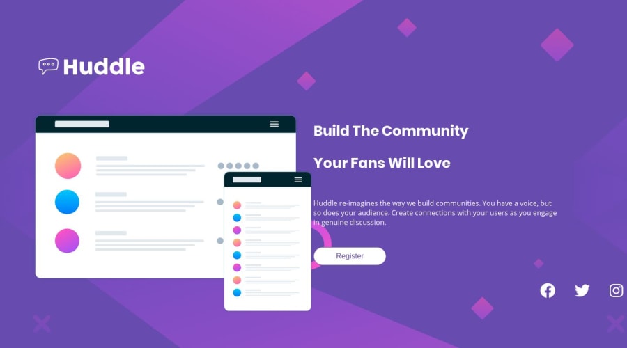
Design comparison
Solution retrospective
Have tried a few times to get the site working in 1440px.
Community feedback
- @ringmPosted over 4 years ago
Hi Brian, congratulations on submitting this project. I just happened to take a quick look yesterday and now it’s looking much better! I downloaded your project to take a look into the code and see how you can make it even better, here are my suggestions:
- First of all, you’re getting an HTML issue because you’re using the
sectionelement and not giving it ah2-h6element as a child. Thesectionelement should represent a standalone section inside the HTML structure. This is not the case in your HTML, since the.company-headingand the.communityare not standalone sections, they are both parts of the same content. I would suggest changing them for regulardivelements and using thesectionelement as a container for both. Example:
<section class="container"> <div class="company-heading"> </div> <div class="community"> </div> </section>- Now, another issue you have right now is that the layout is not centered. If you follow allong with my example, you can center and give it a
max-widthwith very few lines of code. First, remove themax-widthfrom thebodyelement. We’re gonna use the.container, as the... well... the container of the whole design ;P
.container {
  width: min(90%, 1440px);
  margin: auto;
}
The
min()function is extremely usefull and flexible. Basically what it does is to analyse the 2 values you pass, and use the minimum. In this case, we’re passing 90% and 1440px. What it will do is ask ‘what’s the smallest value? 1440px or 90% of my current width?’ If 90% of your current width is less than 1440px, it will use that as the width on the container. This is a very cool way of having a flexible width on the whole layout without worrying about any breakpoints. When the screen size get’s bigger, it will reach a point where 90% of the viewport will translate to a number that is bigger in px than 1440, the function will say ‘hey, 1440px is smaller than 90% of the current viewport, so I’ll stuck at 1440px’. It will basically give amax-widthto your design and prevent it from stretching endlessly. For more information on the min function click here.Lastly,
margin: auto;will center you design (horizontally and vertically). If you don’t see it veritcally centered, try giving the parent element of.containera height of 100vh and that will do the trick ;)- Ok, now that we have the layout centered and we gave it a
max-width, let’s go into the inner components: the image and the text. Here you got it right, the easiest approach would be to setdisplay: flex;in the parent element. Following my example that would be on.container.
.container {
 width: min(90%, 1440px);
 margin: 0 auto;
 display: flex;
}
And that should do it! But we’re not there yet. I can see that you struggle a little trying to match the design. If you’re following my code, I’m gonna ask you to take a leap of faith and just delete some styles you wrote.
• Remove all the
paddingfrom the.header-title,.company-headingand.community• Remove thewidth: 70vh;from the.huddle-content• Remove thewidth: 50%:of.company-headingand.communityAfter doing that you’ll see that the content is sitting on the middle of the screen (in big screens). To ensure they’re the same size and since they're flex items, instead of using
width, we give each of them (.company-headingand.community) aflex: 1;value. Now the should be the same size, which is exactly what we want. To separate them you can addmargin-leftto.communityormargin-rightto.company-heading(5% should look good). Finally, to center the content you can also addalign-items: center;on.container.Finally, for the mobile breakpoint. All you’d have to do is set
flex-direction: column;on.containerand remove either themargin-leftormargin-rightyou set on it’s child elements to have it looking like the design.And that should give you the basic behaviour you want for the whole layout of the page. If you’re still seeing some issues, try removing all the padding’s and margin’s u have on the media query. A lot of times it’s easier to find the bugs when u start removing things.
Sorry if it got too long. I hope it’s not confusing! I really like the job you did, the styles are almost there, I think the main issue was the overall behaviour of the layout, which is what I’ve tried to help you with.
Let me know if you tried my approach and most importantly, if it worked! I’ll be happy to help if you encountered any issues.
Keep up the good work! Happy coding.
1 - First of all, you’re getting an HTML issue because you’re using the
Please log in to post a comment
Log in with GitHubJoin our Discord community
Join thousands of Frontend Mentor community members taking the challenges, sharing resources, helping each other, and chatting about all things front-end!
Join our Discord
