Design comparison
Community feedback
- @JT1974Posted over 2 years ago
Hi Aniket,
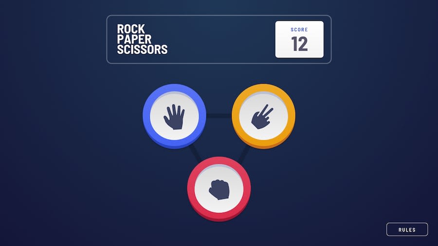
You have done a good job, I would just add a few comments: You left the CRA readme file in the folder. You maybe missed this part in the challenge details... The points can go down below 0, which is not according to the rules, so you could maybe review your code and build in a guarding statement for that. The icons seem to be a little big, you could maybe reduce their sizes, because the button borders are currently cutting off their outer areas. The rules modal looks weird, and it's not readable. I'm not sure why that big circle is around it, and the title is also missing... Did you try to display the triangle svg, because I cannot see it (I couldn't find it in your code either)? The app is working well (exc. for that negative score issue) in all resolutions I checked, so congratulations! Good job!
Marked as helpful0@Aniket1026Posted over 2 years ago@JT1974 thanks for looking and helping me to improvise . I make the changes.😊
0
Please log in to post a comment
Log in with GitHubJoin our Discord community
Join thousands of Frontend Mentor community members taking the challenges, sharing resources, helping each other, and chatting about all things front-end!
Join our Discord
