

Design comparison

Solution retrospective
I had difficulties try to create the desktop version At last I couldn't so I'm just gonna submit it like so.
I would really appreciate if someone could help me out with how to create a desktop version thanks.
Community feedback
- @Benjamin-odekinaPosted about 1 year ago
Firstly, beginning by adding padding to your text DIV below the image. Let's say 20px. Use @media screen and (min-width: 940px) to give conditional styles depending on the user screen sizes
Marked as helpful0 - @hitmorecodePosted about 1 year ago
- I added the picture element into your html (see html) and also add some css rules (see css). With the
pictureelement you can tell a browser to load an image when it's at a certain width. - All you have to do is create a media query and inside the media query set the rules that you want to change. For exampel change the
flex-directionof the.containerfrom column to row
html
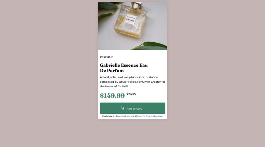
<div class="container">

      <div class="image-holder">
  <picture>
    <source media="(min-width: 800px)" srcset="image-product-desktop.jpg">
    <source media="(min-width: 600px)" srcset="image-product-mobile.jpg">
      <img class="mobile" src="image-product-mobile.jpg" alt="Perfume Image">
<!--       <img class="desk" src="image-product-desktop.jpg" alt="desktop"> -->
  </picture>
  </div>
      <div class="content">
        <h1>Perfume</h1>
        <h2>
          Gabrielle Essence Eau <br>
          De Parfum
        </h2>
        <p>
          A floral, solar, and voluptuous interpretation composed by Olivier
          Polge, Perfumer-Creator for the House of CHANEL.
        </p>
        <div class="price">
          <p id="tag">$149.99</p>
          <p id="del">$169.99</p>
        </div>
        <div class="button">
          <button>
            <img src="icon-cart.svg" alt="Cart Icon">
            <p>Add to Cart</p>
          </button>
        </div>

        <div class="attribution">
          Challenge by
          <a href="https://www.frontendmentor.io?ref=challenge" target="_blank">Frontend Mentor</a>. Coded by <a href="#">Caleb Akomaye</a>.
        </div>
      </div>
      </div>
css
@media only screen and (min-width: 800px) {
  .container {
    flex-direction: row;
    width: 600px;
    height: 400px;
  }

  .image-holder {
    width: 300px;
    height: 400px;
  }

  .image-holder img {
    width: 100%;
    height: 100%;
  }

  .content {
    width: 300px;
  }
}
This is just an example on how you can make it responsive, there are still some bugs that need to be fixed. See if you can manage to fix it, if not feel free to ask
KEEP CODING 👍
Marked as helpful0 - I added the picture element into your html (see html) and also add some css rules (see css). With the
- @lwrncgmbnPosted about 1 year ago
Hello there 😁
To make that work in a desktop view, you can use
display:grid;ordisplay:flexfor that. There are lots of tutorials on YouTube, or you can read different documentations to learn it. Also, to put your main container in the middle, you can usedisplay: flex;justify-content:center;align-items:centermin-height: 100vh;.Happy Coding 😁
Marked as helpful0


Please log in to post a comment
Log in with GitHub
Join our Discord community
Join thousands of Frontend Mentor community members taking the challenges, sharing resources, helping each other, and chatting about all things front-end!
Join our Discord