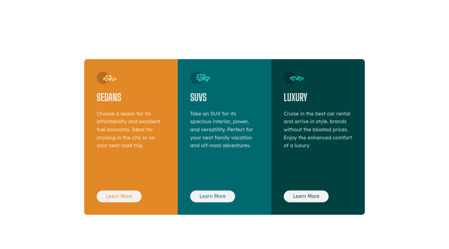
HTML and CSS only, layout with flexbox and mobile first approach


Design comparison

Solution retrospective
Hi for this challenge I tried a mobile first approach where I start with the mobile version and I noticed that it is much easier to go from mobile to desktop than the other way around in my case. Is was wondering if this approach is a standard inside the web world?
I also implemented tags like section and article and I don't know if I used them correctly?
If you have some time to look at my code, I would much appreciate it! If there are others things that I didn't code correctly please let me know :)
Thank you in advance for your feedback.
Community feedback
- @dewslysePosted over 3 years ago
Hello @Cheng-KaWai! Congrats on completing this challenge. Your page looks good. Some things to note:
- You could wrap your content in a
maintag so that your elements would be contained by a landmark. As such, you could change<section class="cards-container">to<main class="cards-container">. - It's nice that you try to use semantic elements in your markup and I think you've used the
articletag well since the individual cards can be considered independent or self-contained. - Also, your page is missing an
h1. Best practice dictates having on h1 element on a page for improved accessibility.
All the best
1 - You could wrap your content in a

Please log in to post a comment
Log in with GitHub
Join our Discord community
Join thousands of Frontend Mentor community members taking the challenges, sharing resources, helping each other, and chatting about all things front-end!
Join our Discord