Design comparison
SolutionDesign
Solution retrospective
appreciate your feedback
Community feedback
- @Nova988Posted about 3 years ago
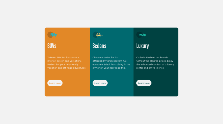
Hey Barath, I have nothing more to add then what Dusan already said except 1 tip: You can add border-radius to the card class instead of the car classes you did. It makes the code a bit easier I think.
Marked as helpful0 - @dusanlukic404Posted about 3 years ago
Hey Barath! Good work but I have some suggestions for you:
- You replaced position of SUVs and Sedans. Sedans should be on first card
- Add more padding to get more white space between content and cards
- Add outline 2px solid #fff instead of border on btn:hover because borders in this case makes cards bigger on hover effect cause they take up some space (Or just add border witdth and style and make color be transparent) <- that's better solution
- Make buttons bigger
Marked as helpful0
Please log in to post a comment
Log in with GitHubJoin our Discord community
Join thousands of Frontend Mentor community members taking the challenges, sharing resources, helping each other, and chatting about all things front-end!
Join our Discord
