Design comparison
Solution retrospective
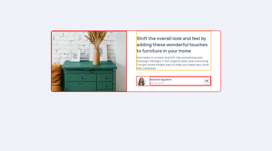
Can someone help me with the active states. I cant fully understand how to do it. and Please leave a feedback. Thank you..
Community feedback
- @GrzywNPosted about 3 years ago
Great job!
You can achieve this by using
position: relativeandposition: absolute(transform: translate()can be helpful too) with each other and CSS pseudoelements::beforeor::afterwith help of some javascript to toggle this share menu. This isn't the easiest thing in the world, but it's worth to struggle a little bit and do it properly. Everything what I mentioned you can easily google and watch some tutorials or read articles about it.Keep coding! Have a nice day! :)
0 - @isprutfromuaPosted about 3 years ago
Hi there. You did a good job 👍
keep improving your programming skills
Your solution looks great, however, if you want to improve it, you can follow these steps:
🟢 remove the active states borders
🟢 move the wrapper with the icons next to the Share button and display them when you hover over the button, or you can add mousenter event listener to the button.
🟢 your layout stops resizing on small screens. I think reducing its minimum width would improve this for better adaptability. Also, share icons is still hidden on mobile.
I hope my feedback will be helpful
Good luck and fun coding 🤝⌨️
0
Please log in to post a comment
Log in with GitHubJoin our Discord community
Join thousands of Frontend Mentor community members taking the challenges, sharing resources, helping each other, and chatting about all things front-end!
Join our Discord
