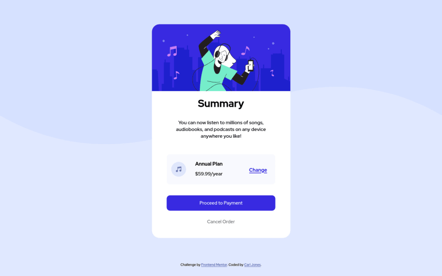
Design comparison
SolutionDesign
Solution retrospective
Had a bit of trouble getting the text to where I wanted them, any advice on how to do it better?
Community feedback
- @Dharmik48Posted about 3 years ago
Hey👋,
Good job with the solution! I just found a couple of issues:
- Use sematic html tags like
main,section,header, etc. more as it is a good practice and good for SEO. - You have not added any
hoverstates to any links and buttons, so add it with sometransition.
Marked as helpful1 - Use sematic html tags like
Please log in to post a comment
Log in with GitHubJoin our Discord community
Join thousands of Frontend Mentor community members taking the challenges, sharing resources, helping each other, and chatting about all things front-end!
Join our Discord
