

Design comparison

Solution retrospective
What's up guys ?! So here's my little solution for this challenge(not perfect, of course). Any feedback are welcomed! Don't hold back :)
Community feedback
- @RayaneBengaouiPosted over 3 years ago
Hello Sebastien,
Congrats for completing this challenge ! 🙂
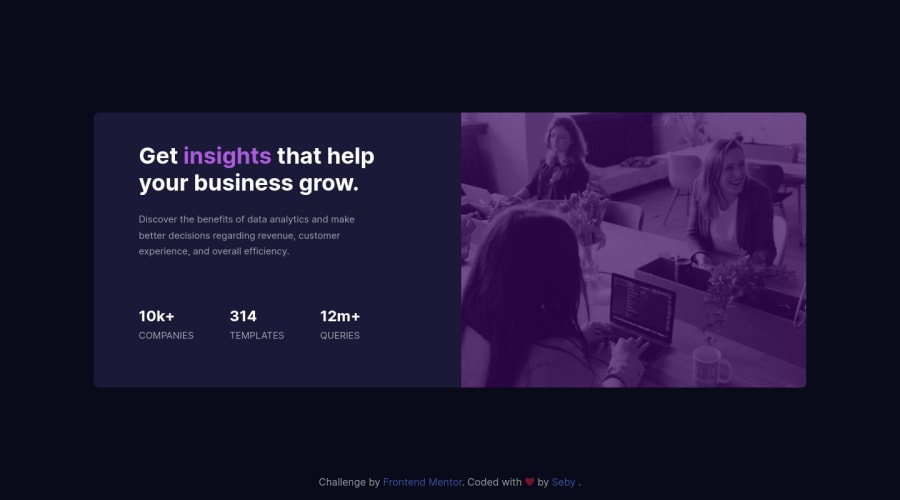
I think that you could just decrease a little bit the opacity of your linear gradients on the image or use
mix-blend-modeproperty to get closer of this purple color. Also a little bit more ofmargin-topwould be nice.Overall, well done for the challenge and happy coding ! 😃
2@SebystienPosted over 3 years ago@RayaneBengaoui
Hey RayaneBengaoui,
Thank you for the feedback!! Will give it a try 🙌, will update it soon!
0 - @ApplePieGiraffePosted over 3 years ago
Hey there, Sebastien! 👋
Good work on this challenge! 👍 Your solution looks good and responds rather well! 🙌
The only minor thing I suggest is probably to vertically center the card component in the viewport so that it always remains in the center of the screen (currently it sticks to the bottom of the page instead). 😉
Keep coding (and happy coding, too)! 😁
1@SebystienPosted over 3 years ago@ApplePieGiraffe Hey Apple! I used flexbox to align it..not sure why but I'll run check my code :) Thank you for the feedback! 🙌
0


Please log in to post a comment
Log in with GitHubJoin our Discord community
Join thousands of Frontend Mentor community members taking the challenges, sharing resources, helping each other, and chatting about all things front-end!
Join our Discord