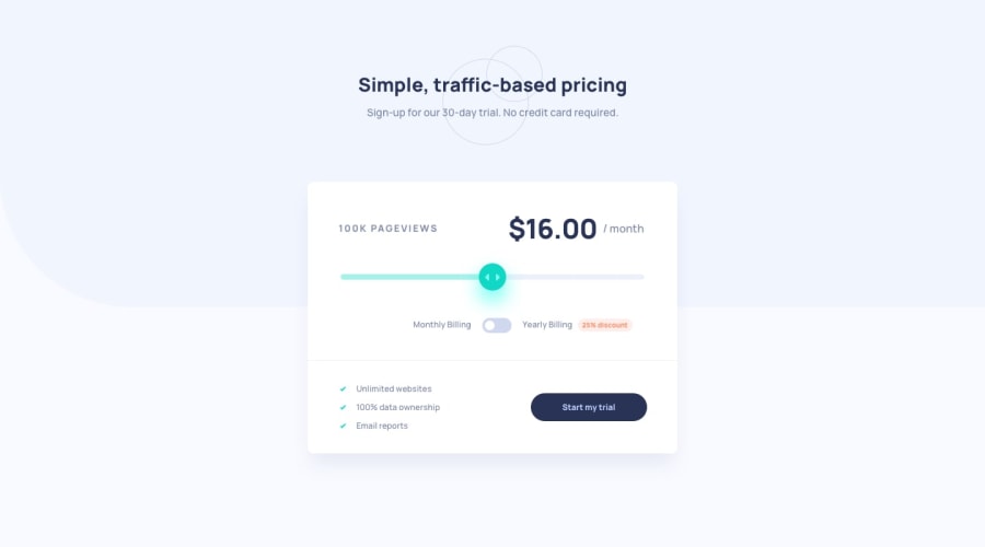
Design comparison
Solution retrospective
Hello,
It would be great to get yours feedbacks and hear some tips. I had a trouble with adjusting track so that it was moving behind the thumb... This is my first touch with BEM not sure it looks proper.
Thanks,
Community feedback
- @skyv26Posted almost 3 years ago
Hi! Koyun, Really nice you have complete this task, but i have noticed some issues in your work as mentioned below:
-
Your design look and feel is not that much good. Like slider shadow is really too much. your buttons looks not great and also the detailing like hover effect is missing.
-
In desktop mode your
.submitBox_listdata is not aligned properly to left side. Tip
.submitBox_list { list-style: none; text-align: center; }from above css class rule cut text-align property and add it into the media queries for mobile, and Booom it will work.
- Also the problem that you had mentioned, please fix that too.
Fact I like
Your design is responsive it is really good to see your design on all width-screen consistently.
Overall Good Work!
Marked as helpful1 -
Please log in to post a comment
Log in with GitHubJoin our Discord community
Join thousands of Frontend Mentor community members taking the challenges, sharing resources, helping each other, and chatting about all things front-end!
Join our Discord
