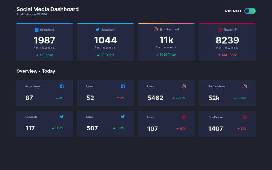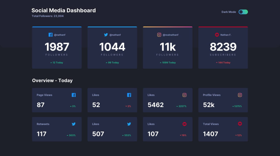
Grid System, FlexBox, Box Model , Javascript etc
Design comparison
Solution retrospective
Hey guys ! Another challenge is done 🎉 Any comments and feedbacks are welcome :)
Community feedback
- @ccreusatPosted about 3 years ago
Really really good job ! So clean :)
You could look about LocalStorage to keep users preferences about dark/light theme. Even give a shot to @prefers-color-scheme
Marked as helpful0@MarufjanPosted about 3 years ago@ccreusat hi Mate 😄
Umm, I did not get your point here. What is the LocalStorage? where can I find @prefer-color-scheme?
Thanks for your compliment hehe :)
0@ccreusatPosted about 3 years ago@Marufjan localstorage gives you the ability to "save" anything you want in the user's browser . You could save the change about the theme (dark or light) and when the user comes back to your website, he will see the last change he did. If he choose to have the light theme, he will see the light theme next time. here's https://developer.mozilla.org/fr/docs/Web/API/Window/localStorage
@prefer-color-scheme will give you the opportunity to detect if the user's OS is set on the dark or light mode. https://developer.mozilla.org/fr/docs/Web/CSS/@media/prefers-color-scheme
Marked as helpful0 - @Dharmik48Posted about 3 years ago
Hey👋,
Your solution is really good! Looks great, but.. I just found one issue:
- Below screen width of
375pxthe cards all become aligned like on bigger screen instead of like it should be on small screens.
Apart from these, it looks really good, Keep it Up👍
Marked as helpful0@MarufjanPosted about 3 years ago@Dharmik48 hey Mate 😃
well, in given styles the mobile screen was 375px. So, I did not consider the screen size smaller 375px lol.
Thanks :)
0 - Below screen width of
Please log in to post a comment
Log in with GitHubJoin our Discord community
Join thousands of Frontend Mentor community members taking the challenges, sharing resources, helping each other, and chatting about all things front-end!
Join our Discord
