Design comparison
Community feedback
- P@toshirokubotaPosted about 2 months ago
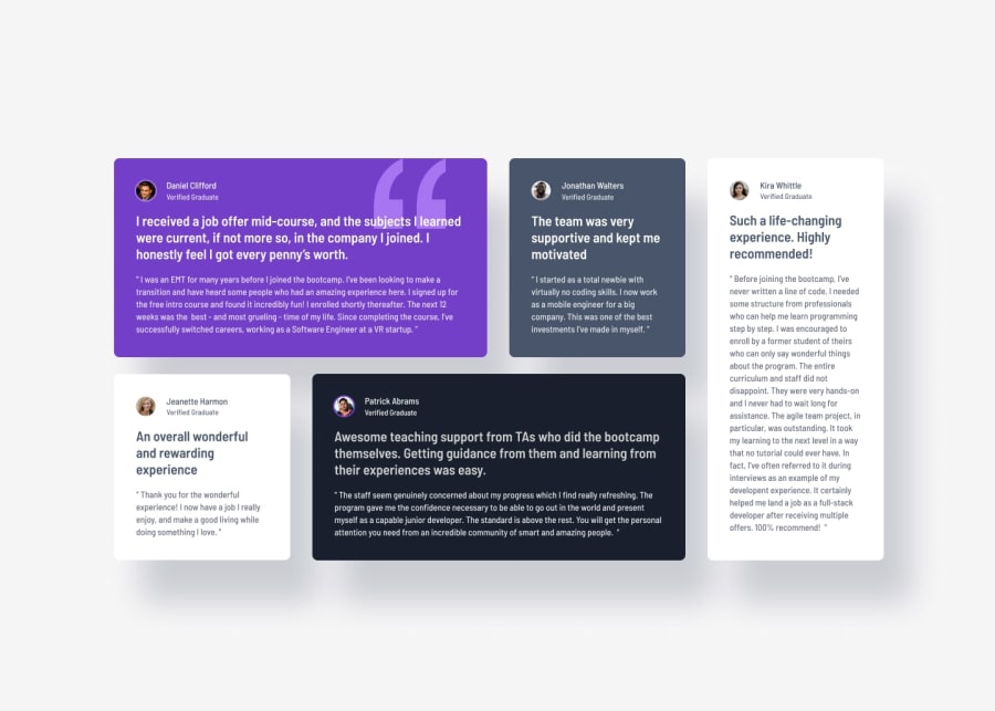
Hi, your solution looks good! I have a couple of comments. First, there is a border around two avatar photos (Daniel and Patrick) in the original design, if you look closely. The color I used for it was not in the style guide, but according to figma, #A775F1. Second, 'color' is styled twice in '.item .content .sub' selector. One is 'light gray' and the other is 'very dark blakish blue'. Right now, 'light gray' is the one used in rendering. You want to apply these colors differently for each card to have the right contrast with the background. I read somewhere that you often want to set background-color and color in pair. So wherever you change your background color, you want to set a proper foreground color as well.
Good luck!
0
Please log in to post a comment
Log in with GitHubJoin our Discord community
Join thousands of Frontend Mentor community members taking the challenges, sharing resources, helping each other, and chatting about all things front-end!
Join our Discord
