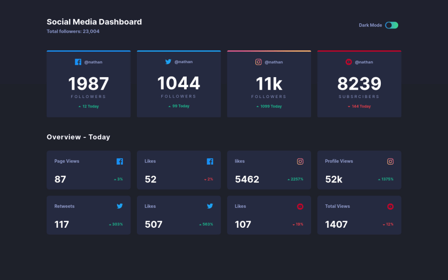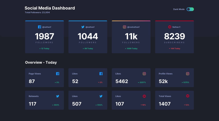
Grid, FlexBox, React, StyledComponent, Themeprovider....
Design comparison
Solution retrospective
I really liked this project, let me know pls what do you think about it ! Keep Coding !
Community feedback
- @avatarfreakPosted over 3 years ago
It is really looking nice. One minor issue in mobile devices, there is a horizontal shift in layout, overflow kind of issue. Happy coding.
1@Barna-MolnarPosted over 3 years ago@avatarfreak
Hi, thx, could you send me a screenshot to my email what do you mean , ' cos I don't see or check this shifting problem .
0@avatarfreakPosted over 3 years ago@Barna-Molnar I checked there is no shifting. It is perfectly alright my bad. In dark mode, I see the heading is getting disappear on mobile but on desktop it is showing. Maybe, because of the browser version at least on my device, it is happening. Other than that great work using React and style components.
0
Please log in to post a comment
Log in with GitHubJoin our Discord community
Join thousands of Frontend Mentor community members taking the challenges, sharing resources, helping each other, and chatting about all things front-end!
Join our Discord
