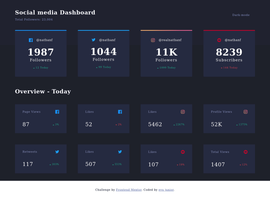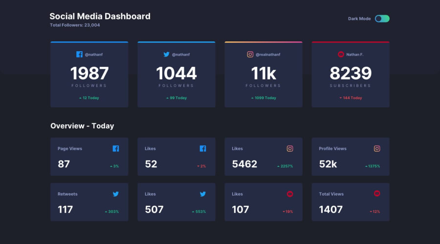
Design comparison
SolutionDesign
Solution retrospective
i switched to using a radio button instead of toggles because i didnt know how to do that at the time
Community feedback
- @tedikoPosted about 4 years ago
Hi Eyobel kirub!
Well done on this challenge! What I can help you with is:
- Set a
max-widthon the container so that the content of the page doesn't look too stretched on large screens. - Check this Toggle Switch and try to make a toggle button. It is not as difficult as it seems!
- Below 400px width on mobile screens your content isn't aligned to center.
Good luck, have fun coding :)!
Marked as helpful1 - Set a
Please log in to post a comment
Log in with GitHubJoin our Discord community
Join thousands of Frontend Mentor community members taking the challenges, sharing resources, helping each other, and chatting about all things front-end!
Join our Discord
