Design comparison
SolutionDesign
Solution retrospective
ok
Community feedback
- @tedikoPosted over 3 years ago
Hello, fajar! 👋
Congrats on finishing another challenge! Your solution responds well and looks good. Kudos for clicking effect on buttons. What I'd suggest you is:
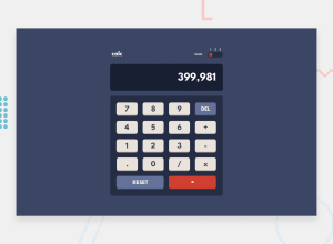
- Your calculator isn't aligned to center. To achive that add these styles to your body since you're familiar with Flexbox:
display: flex;
flex-direction: column;
justify-content: center;
align-items: center;
min-height: 100vh;
Good luck with that, have fun coding! 💪
1 - @palgrammingPosted over 3 years ago
your color modes are not staying selected I guess that is the first thing to work on
second you need to add in more logic into the calculator to prevent things like multiple ....... entered in a row
1@fazar301Posted over 3 years ago@palgramming thank you for feedbackk, I already fix it ^_^
0
Please log in to post a comment
Log in with GitHubJoin our Discord community
Join thousands of Frontend Mentor community members taking the challenges, sharing resources, helping each other, and chatting about all things front-end!
Join our Discord
