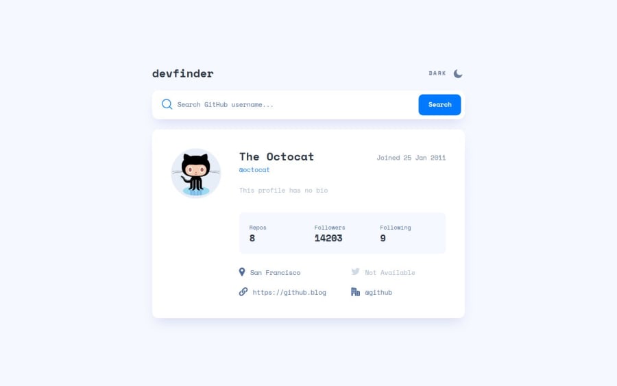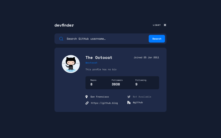
Design comparison
Solution retrospective
While I think it is a good idea have search suggestions, I'm not entirely happy about how they work, because:
- due to pagination and rate limits it's not always possible to find the user you want
- clicking on an item doesn't always display the profile, yet I don't know what's the cause for that
I probably should have positioned the search suggestions instead of placing them on a grid layout.
What challenges did you encounter, and how did you overcome them?Making the suggestion list work.
- At first I had skeletal screen for all items but the experience was bad, so I decided to discard that
- I had trouble positioning the list, so I used CSS Grid but I'm not entirely happy with the result
- Clicking on the item doesn't always work, I haven't been able to figure out why
Any suggestions about:
- fixing the item clicking issue
- dealing with rate limits
are welcome. I'll be grateful for any other feedback as well.
Community feedback
- @Mahmoud-ElagamyPosted 9 months ago
Great job, but i have notice that if i clicks on search button the app will be rendered although the input is empty.
Marked as helpful1P@ania221BPosted 9 months ago@Mahmoud-ElAgamy
Thank you very much for noticing and letting me know :) I'll fix it!
1
Please log in to post a comment
Log in with GitHubJoin our Discord community
Join thousands of Frontend Mentor community members taking the challenges, sharing resources, helping each other, and chatting about all things front-end!
Join our Discord
