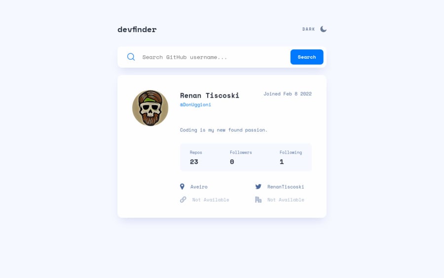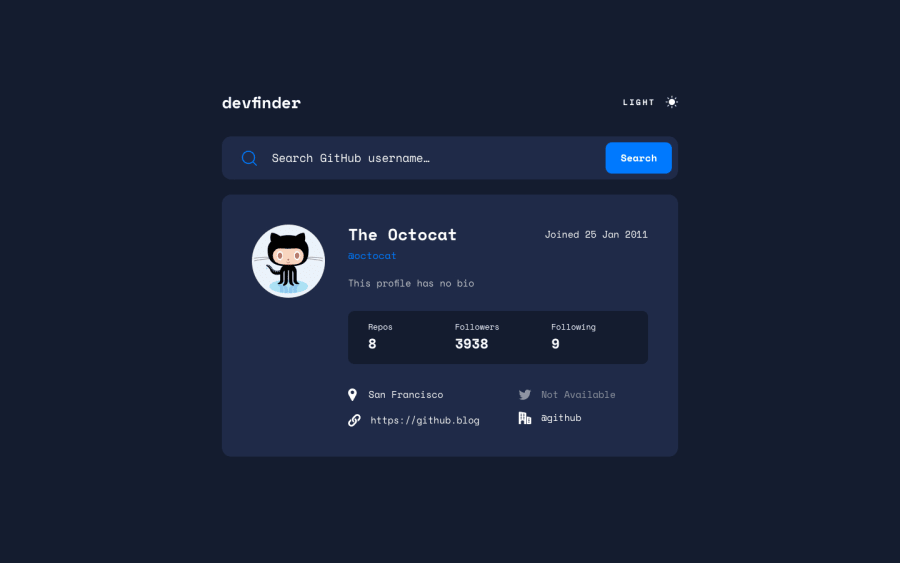
Github Search app with HTML, CSS and Vanilla JS
Design comparison
Solution retrospective
Hello everyone,
This was a nice challenge to keep practicing working with API's.
I couldn't quite figure out how to use the "prefers-color-scheme" on CSS so, if anyone could help me on that, it would be great.
Also, it's the first time I've done a dark/light switch so, if there's a better way to do it, please let me know, pretty sure I could use the css variables in a more efficient way.
Any input on my JS code is also welcome.
Happy coding 🤓
Community feedback
- @vanzasetiaPosted over 2 years ago
Hi, Renan Tiscoski! 👋
Congratulations on finishing this challenge! 🎉
For the theme switcher or the theme toggler, I recommend using an interactive element for it like
buttonor checkbox. Currently, it is not accessible by keyboard and screenreader. I recommend reading the "A Theme Switcher | Inclusive Components" and "Toggle Buttons | Inclusive Components" articles. These are articles were helping me to create an accessible theme switcher.Some more suggestions:
- The moon and the sun icons are decorative images. So, I recommend doing some research on how to handle decorative SVGs.
- For the
prefers-color-schemeI used CSS custom properties to handle all the colors. You can read the README of my project where I explain how I handled the colors.
That's it! I hope you find this useful! 😊
Marked as helpful0@DonUggioniPosted over 2 years ago@vanzasetia Hey thanks for your feedback!
I will definitely check those out!
Accessibility is something that I need to work on for sure.
Thank you!
0
Please log in to post a comment
Log in with GitHubJoin our Discord community
Join thousands of Frontend Mentor community members taking the challenges, sharing resources, helping each other, and chatting about all things front-end!
Join our Discord
