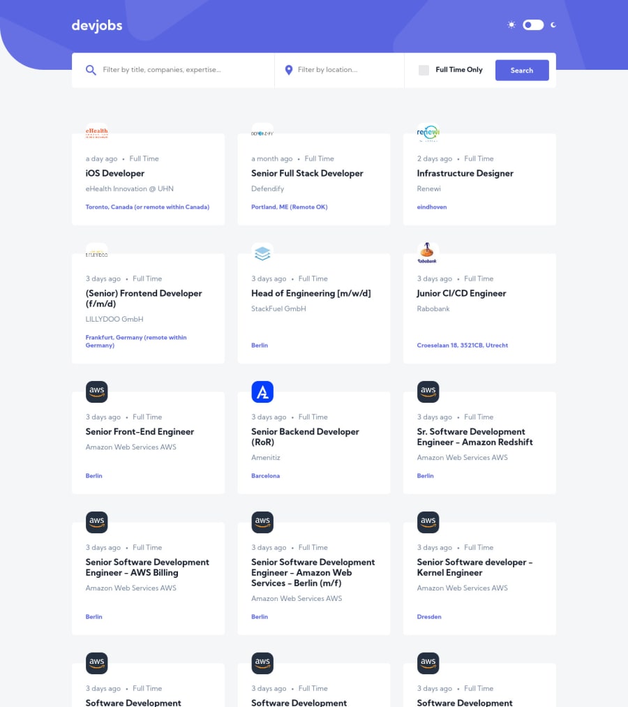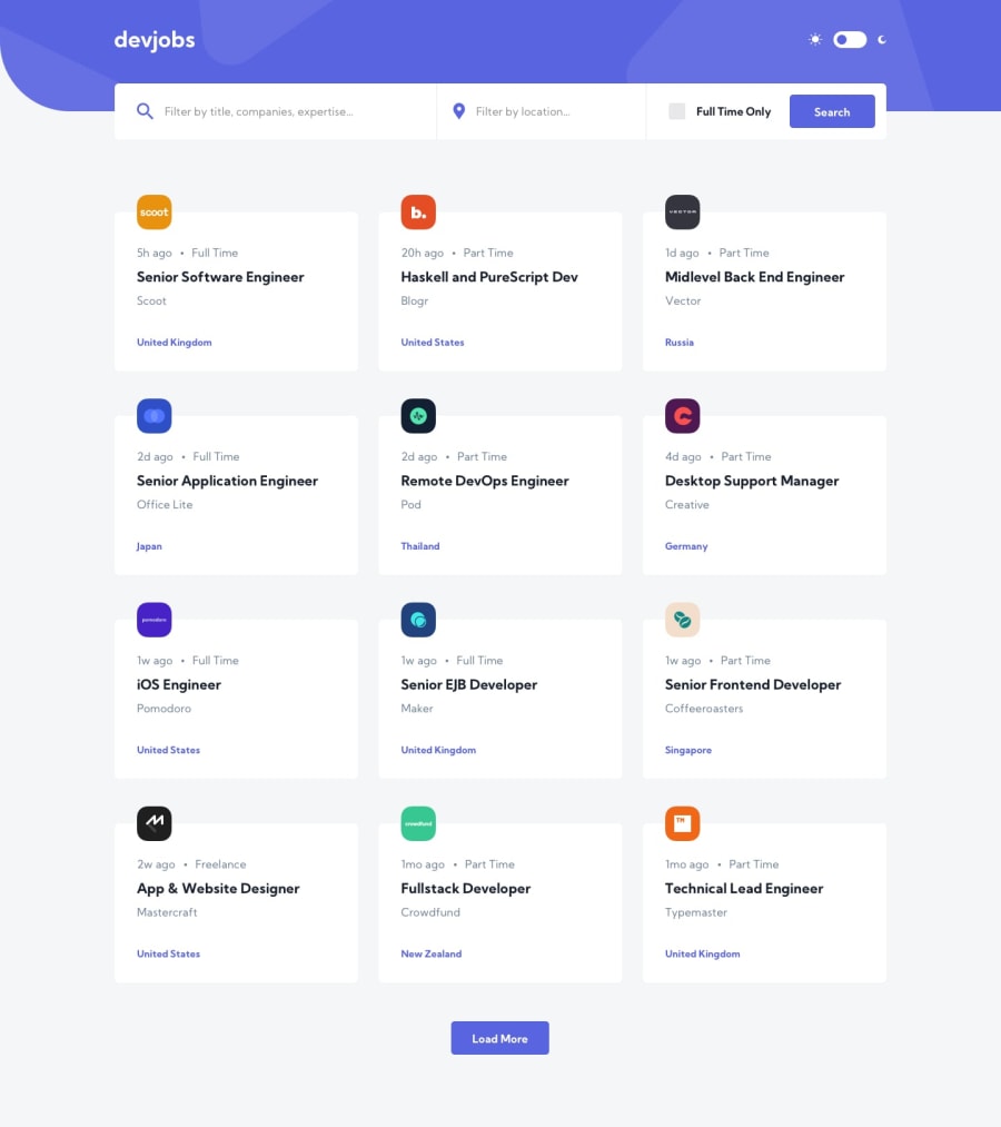
GitHub Jobs API | built with React and React Query
Design comparison
Solution retrospective
Feedbacks are welcome 😆!
I had a lot fun when working on this project (especially trying out the new tool I found for data fetching and caching 👉React Query.) The color scheme is great, the overall looks way better than the original jobs.github.com/positions 😆 LOL! If I would build a job hunting website in the future (with backend), this is something I would consider for the frontend first😎.
However, some part of the design is kind confused 🤯, e.g. there is no back button on the job detail page 👀, also there is no way to clear the job filters 😬. I hope there would be some similar projects like this in the future.
I got some 429 Too Many Requests error when working on the filters, therefore, instead of fetching new data from the request when click search, I just filtering within the cached data, and click load more will apply the filters to the new coming data as well. In such way I can reduce some requesting to avoid that error 😬.
Thanks for reading my annoying comments 😂LOL and happy coding 🙌!
Community feedback
- @ApplePieGiraffePosted about 4 years ago
Hey, Connor Z! 👋
Wonderful work on this challenge! 👏 Everything looks great and works really well! 👍
I like the subtle page transitions between clicking on jobs and going back to the jobs home page! 🤩
Keep coding (and happy coding, too)! 😁
1@zuolizhuPosted about 4 years agoThanks @ApplePieGiraffe ! I always got encouraged by your warm comments 🥰 ! Happy coding too 🙌!
0 - @MasterDev333Posted about 4 years ago
Great work, @Connor! It's beautiful. Everything is fully responsive and very close to design. In my humble opinion, it would be better if you set background-image for logos rather than img elements. Now the logos are cut out. Anyway, "Perfect"!! Happy coding~ :)
1@zuolizhuPosted about 4 years ago@MasterDev333 Thanks for your valuable suggestion! Most of the logos from the API are not squared, some of them came with a rectangle shape, I have to decide cut them out or zoom in but only show a part of the logo 🤣.
0
Please log in to post a comment
Log in with GitHubJoin our Discord community
Join thousands of Frontend Mentor community members taking the challenges, sharing resources, helping each other, and chatting about all things front-end!
Join our Discord
