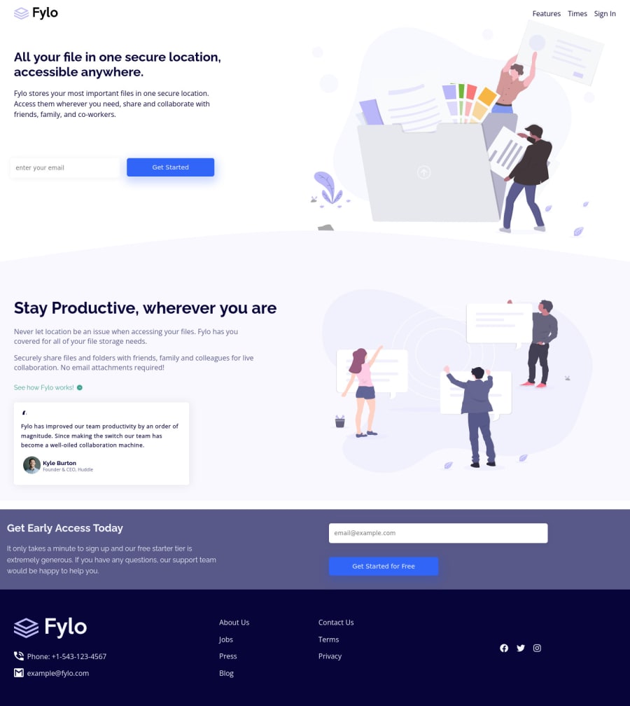
Fylo Landing Page with Two Column Layouts using HTML, CSS & JS
Design comparison
Solution retrospective
Hoping for a nice feedback about the layout there are some issues!!
Community feedback
- @PhoenixDev22Posted about 2 years ago
Hi Abhishek choudhary,
Excellent work! I have some suggestions regarding your solution:
HTML
- Use the interactive element
<a>
around your navigation like this<li><a href=”#”>Features</a></li>
.
- The alternate text of the logo should not be
logo
, you may set alt=”Fylo". Use the website's name as an alternate text. Remember that a website-logo is one of the most meaningful images on a site so use proper alt for it. The same for the footer’s logo
- If you are going to leave the logo not wrapped by
<a>
, it’s better to place it out the<nav>
as it does not navigate the user in anywhere (only an image).
- look up a bit more about how and when to write alternate text on images. Learn the differences between decorative/meaningless images vs important content . For decorative images, you set an empty
alt
to it with anaria-hidden=”true”
to remove that element from the accessibility tree. This can improve the experience for assistive technology users by hiding purely decorative images.
- It’s recommended to specify the type of the button , it’s
type=”submit”
.
- Profile images like that avatar are valuable content images, not decorative. For the alternate text of the avatar testimonial should not be avatar. You can use the avatar’s name
alt=" kyle burton"
.
- You may use like to use
<address>
tag to wrap the contact informationclass="contact"
for the author/owner of a document or an article (email and phone number). By adding semantic tags to your document, you provide additional information about the document, which aids in communication.
- When you use the
<nav >
landmark to wrap the footer navigation, you should addaria-label=”secondary “
oraria-label=”footer”
to it . A brief description of the purpose of the navigation, omitting the term "navigation", as the screen reader will read both the role and the contents of the label. Thenav
element in the header could use anaria-label="primary"
oraria-label=”main”
attribute on it. The reason for this is that, you should add thearia-label
for a nav element if you are using the nav more than once on the page.you can read more in MDN
- In the footer’s logo , the SVG does not contain any visible text that describes the graphic, we need to add the alternative text (invisible) by:
<title>
A short title of the SVG</title>
- Add the appropriate ID’s to the
<title>
. - It must be the first child of its parent element
On the
<svg>
tag, add aria-labelledby="uniqueTitleID”.
- Instead of using a generic div to wrap the footer links in
social--wrapper" and class="links--wrapper"
, you put your links within an unordered list structure so that a screen reader will read out how many things are in the list to give visually impaired users the most information possible about the contents of the navigation.
-
Add the interactive element
<a>
around your icons inclass="social--wrapper"
. For this instance, they are not clickable neither navigate the user. -
Links must have discernible text. The social links wrapping the icons must have
aria-label
orsr-only
text indicate where the link will navigate the user. Then your icons are purely decorative, you'll need to manually add an aria-hidden attribute to each of your icons to be ignored by screen readers to avoid redundancy and repetition
Aside these, great job on this one. Hopefully this feedback helps.
0 - Use the interactive element
- @EhtishPosted about 2 years ago
Hello @dazzlerabhi30800, Congratulations on completing challenge. I have analyze your code. Add the Following code to improve your layout.
.navbar { padding block:2rem; /*Note: Remove your navbar padding */ } /*Add your gray curve image */ .header--wrapper{ background-image: url(images/bg-curve-desktop.svg); background-repeat: no-repeat; background-position: bottom center; }
0
Please log in to post a comment
Log in with GitHubJoin our Discord community
Join thousands of Frontend Mentor community members taking the challenges, sharing resources, helping each other, and chatting about all things front-end!
Join our Discord