
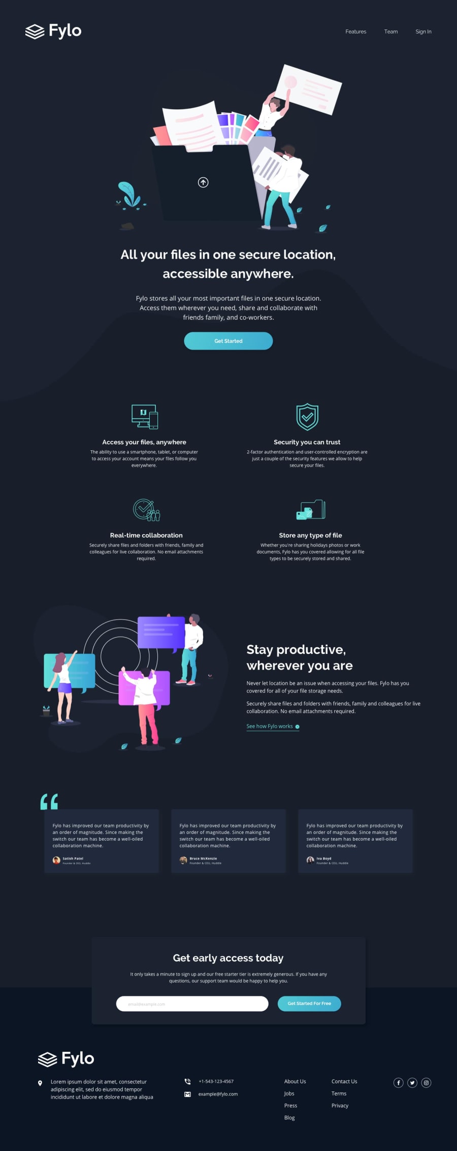
Fylo landing page with dark theme built with HTML | CSS | JS - MikDra1


Design comparison
Solution retrospective
💻 Hello, Frontend Developer Community,
This is my solution for the Fylo landing page with dark theme.
-
Scored 96.25% on Google Pagespeed Insights! 🚀
-
Solution with 100% W3C validation accuracy 🌟
-
Custom-built CSS animations for a smooth user experience 💫
-
Added sticky header with a special animation when scrolled ✨
-
Custom button animation on click and on hover 🖱
-
Fully responsive design crafted with a mobile-first approach 📱
-
Enjoyed every moment coding this! 😎
-
Feedback is always welcome—let’s grow together! 🌱
-
Completed 14 out of 30 Junior Challenges so far—keeping up the momentum! 🔥
-
👨💻 Join me on my coding journey as I tackle advanced challenges and add innovative touches to every project.
-
Looking forward to hearing your thoughts and suggestions! 💡
Community feedback
- @YuliaLantzbergPosted 3 months ago
Heyyy. Looking good but there are some notes. *In HTML you put header inside main tag. Usually they are sibling tags and I don't see in this case why to change it. The header can absolutely be a separate element here without need of any outer container except body tag. *You haven't any spacing between the beginning of the page and the header element. *The quot icon is hidden behind the card. I guess z-index will resolve the problem or according to the original design you need to align it. (Tho I think with z-index it will look cooler) *The list in the footer is not aligned. It should be smth like flex-start and not center. *And there is a small bug with the hover effect when in mobile view, the button itself is growing unproportionally. Tbh, I don't know if it's your bug or of the browser. *The email check works perfectly *Why did you define the header effect only for screens greater than 1600? It will look great and useful also on smaller screens. But it's looking awesome anyway.
*For me a bit hard to read code when the media queries are spread in between regular code and code is not structured as per the page or HTML structure. But, it's only my opinion and I guess it's more about personal preference. Hope it's somehow helpful.Marked as helpful0@MikDra1Posted 3 months ago@YuliaLantzberg Thanks, for replay 😁
- I change main and header tag so they are sibling elements right now.
- I added some more spacing between header and beginning of the page. The photo is just not super clear.
- The quote on the design is behind the testimonial because this is how it was on the design. Now I see they might have changed it.
- The hover effect on mobile won't work if you start on mobile device. I added a load event to the window which checks whether if the loaded device screen width is grater then 1000 only then it works. So if you the resize the screen width with the devTools and you click on the button it will have this effect because your loaded screen size is more then 1000px. If you want to check this try opening the website on your phone.
- I changed the header effect so now it works across all screen widths
- Media queries are spread across whole code because of the SASS compiler. I add media queries to all elements and not just in one file at the end. And that's why media queries are all over the file 🤗
1@YuliaLantzbergPosted 3 months ago@MikDra1 Thnx for explaining. I saw that you set the 1000px boundary but couldn't understand why it's still visible in the devTools. Now I got it
0

Please log in to post a comment
Log in with GitHub
Join our Discord community
Join thousands of Frontend Mentor community members taking the challenges, sharing resources, helping each other, and chatting about all things front-end!
Join our Discord