Design comparison
Solution retrospective
Hi all 👋
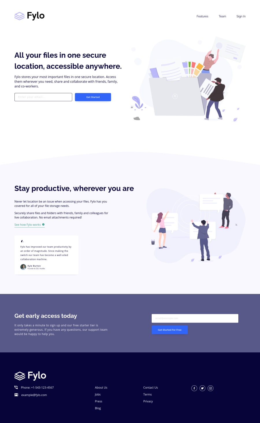
I decided to do this challenge with SASS, CSS Grid, Flexbox, BEM.
Happy coding 😊.
Community feedback
- @ApplePieGiraffePosted about 4 years ago
Hello there, Jesús Alejandro Atao! 👋
Wonderful job on this challenge! 👏 Your attention to detail has been pretty great and I only noticed two breakpoints for the whole site in Chrome's dev tools—which I think is pretty cool! 😎
I only suggest adding a
max-widthto the main container or wrapper of the page to prevent the content of the page from becoming too wide or separated on extra-large desktop screens. 😉Of course, keep on coding (and happy coding, too)! 😁
1@JesusAtao96Posted about 4 years ago@ApplePieGiraffe Thanks for the advice. 😊
1
Please log in to post a comment
Log in with GitHubJoin our Discord community
Join thousands of Frontend Mentor community members taking the challenges, sharing resources, helping each other, and chatting about all things front-end!
Join our Discord
