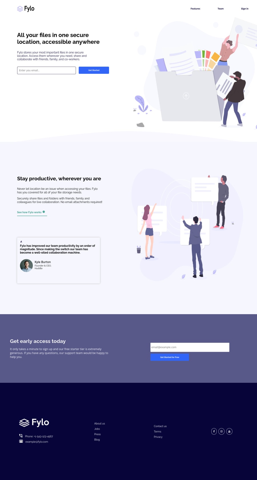
FYLO LANDING PAGE TWO COLUMN LAYOUT USING HTML AND CSS BY REYDEL OCON
Design comparison
Solution retrospective
ANY FEEDBACK WOULD BE APPRECIATED THANK U
Community feedback
- @ChamuMutezvaPosted about 3 years ago
Greetings Reydel. Some issues that needs fixing have been raised in the report and may include the following.
- use semantic elements where possible. Elements such as header , main , footer, nav makes your site more accessible than divs.
- alt values should be descriptive enough for the benefit of assistive technology users - they should be able to visualize the message that is being put across. Values like
logo, image , graphic, iconshould not be used as these words are automatically read by screen readers. - using more that one
h1element does not cause an error but is considered not good practice as it is not beneficial to assistive technology users. - form inputs like email should have an associated label
- in your css avoid heavy nesting , like the following
.header__holder .nav__holder li a
1@reydelshitPosted about 3 years ago@ChamuMutezva thank u bro. I did not know that using too many divs can affect the accessibility of the website. I have been using it for weeks now. I did not know it was a bad practice after all. Thank you bro for your feedback bro. I will keep that in mind and I will use it in the future
0@ChamuMutezvaPosted about 3 years ago@reydelshit, it is not literally about
too many divs, but a div does not have a specific use where as some elements are designed to carry out a specific task. Header, main, footer, nav etc. So instead of having a div element as the header - use theheaderelement, your main content should then be having themainelement as the parent0 - @Shahab-MalikkPosted about 3 years ago
Hi nice work
- First of all remove accessibility issues
- Make anchor tag effective you can use
hovereffect 3.There are also responsiveness issues this webpage is only responsive for mobile screens , so try to make it responsive - Also work on social icons in footer Keep Coding
1@reydelshitPosted about 3 years ago@shahabmalik996 thank u bro. This is my first mobile first website btw. I'll keep that in mind and use it in the future bro
0 - @Dharmik48Posted about 3 years ago
Hey👋,
Great job with the solution! But there are a few issues:
- Change the point for the media query as around
1000pxthe site starts to looked squeezed. - Also add some
transitionto hover states.
0@reydelshitPosted about 3 years ago@Dharmik48 thank u bro. I'll keep that in mind and use it in the future
0 - Change the point for the media query as around
Please log in to post a comment
Log in with GitHubJoin our Discord community
Join thousands of Frontend Mentor community members taking the challenges, sharing resources, helping each other, and chatting about all things front-end!
Join our Discord
