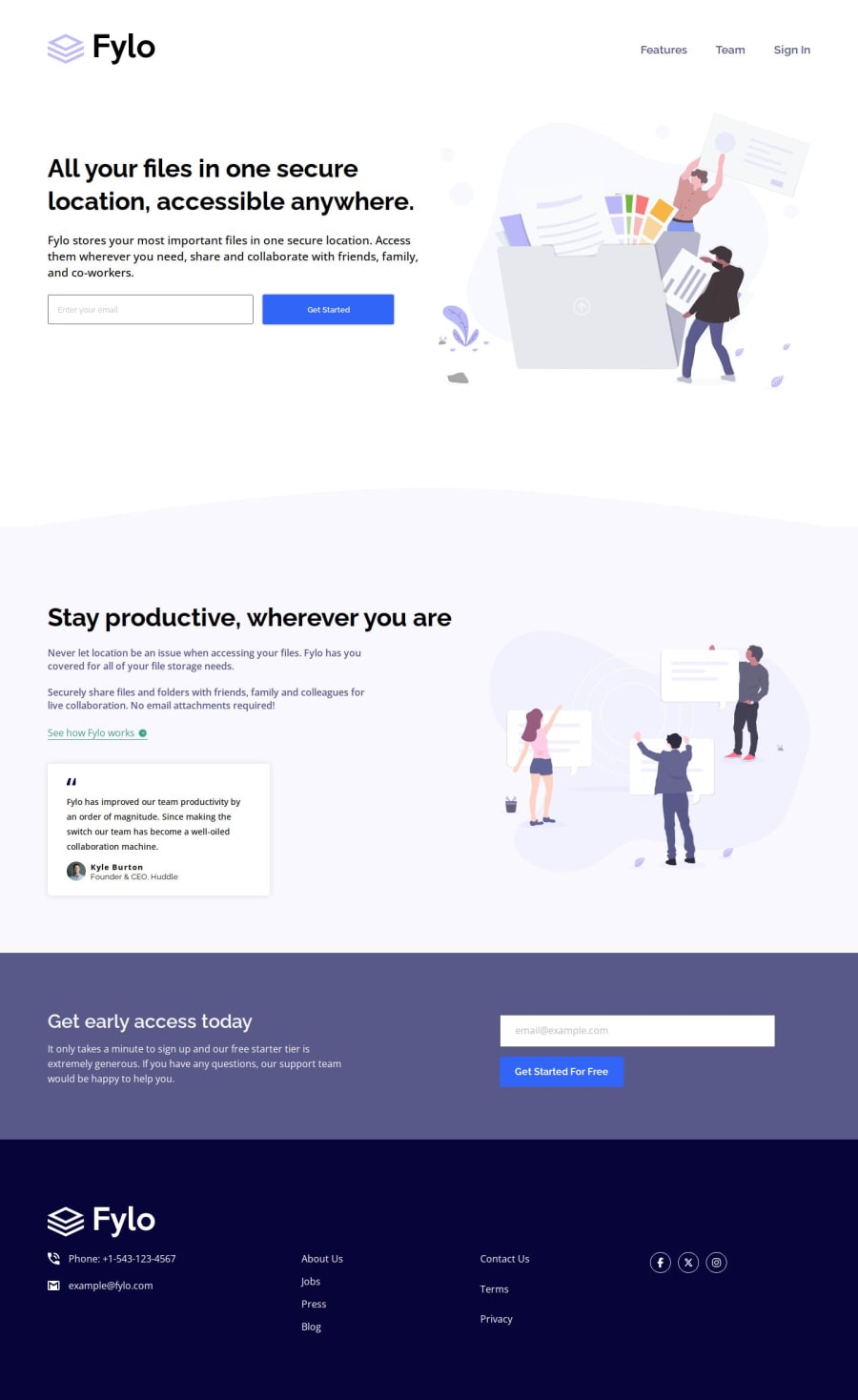
Fylo Landing Page (HTML + Vanilla CSS + JavaScript)
Design comparison
Solution retrospective
Hello! I'm Daniel and this is my solution for this challenge! 😊
🛸 Features:
- Built with Vanilla CSS + Very simple Javascript email validation ✉️
- Used Prettier code formatter to ensure unified code format ⚙️
- Responsive layout using mobile first workflow approach 📲
Good challenge. Dificult to get the exact measures without the Figma files, but I think it turned out fairly good for a project built by eye. Not much room for customization in this one, so I didn't add or change anything other than the email validation with Javascript.
If you have any suggestions on how I can improve this project, feel free to leave me a comment!
Feedback welcome 😊
Community feedback
- @SaleiuxPosted about 1 year ago
WOW! Your project look perfect like always! I did the same project and I had some problem! Where did you find the logo with the white text for the footer? And what you did with the svg image in the background, my image doesn't look like this! Any suggestion will be appreciate! And thank you, it always usefull to see the same project did by an expert!
1P@danielmrz-devPosted about 1 year agoHello @Saleiux !
Thanks for the kind words, but I'm still very far from being an expert 😅
About the white logo, I had to duplicate it and manipulate one of the svg files to make it turn white, I'll leave a comment with a better explanation on your solution 😊
1 - @AdeMEDIAPosted about 1 year ago
Nice job on Completing the Challenge. It's looking great 😃 and awesome. Can't wait to hop on this challenge.
I just finished my JavaScript programming course on coursera. I can't wait to start working more on JavaScript Challenges 😁. Nice one mate, wish to be like you some day. All love 💕 seer.
1
Please log in to post a comment
Log in with GitHubJoin our Discord community
Join thousands of Frontend Mentor community members taking the challenges, sharing resources, helping each other, and chatting about all things front-end!
Join our Discord
