Design comparison
Solution retrospective
Hi there
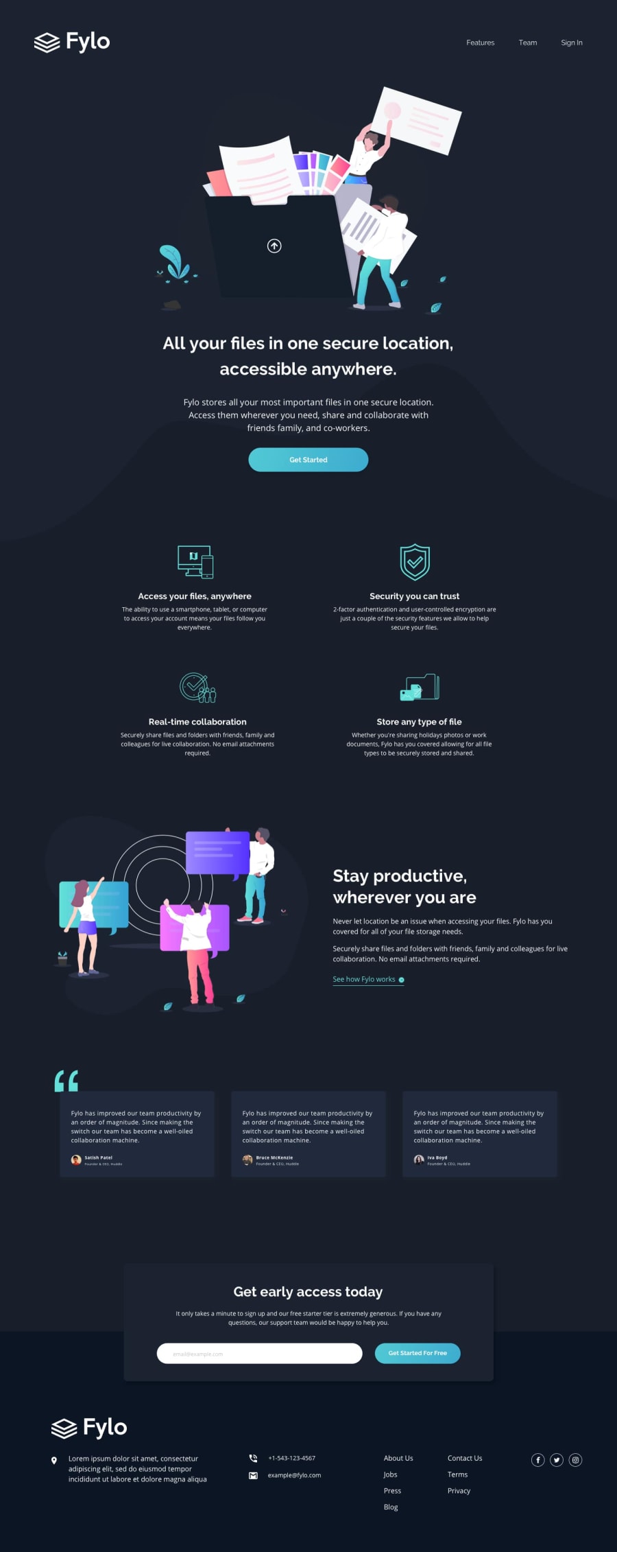
I just finished this project, the desktop media queries are for 1024px computer. Also where is best seen the mobile version is on Firefox (iPhone 11 Pro).
Any feedback is welcome :)
Thanks!
Community feedback
- @ronaldlamdevPosted over 2 years ago
Great job on coding this challenge. There is one thing I would change with your email form. I would change the input for your email to text in your HTML. For example, I would change <input type="email"/> to <input type="text"/>. This will remove the default error message (not the red error message), but it'll make your form error cleaner and easier to read. Having two error messages is kinda redundant.
I would also start using more id attributes in your HTML instead of repeatedly using class to name your tags. The benefit of this is that id attributes allow links to navigate to other sections of your code. For example, instead of class = "features", use id = "features". As for <li> features </li>, use <li href="#features"> features </li>. This way, the site itself will automatically scroll to the feature section of your site instead of having the user manually scroll to the site.
Marked as helpful1
Please log in to post a comment
Log in with GitHubJoin our Discord community
Join thousands of Frontend Mentor community members taking the challenges, sharing resources, helping each other, and chatting about all things front-end!
Join our Discord
