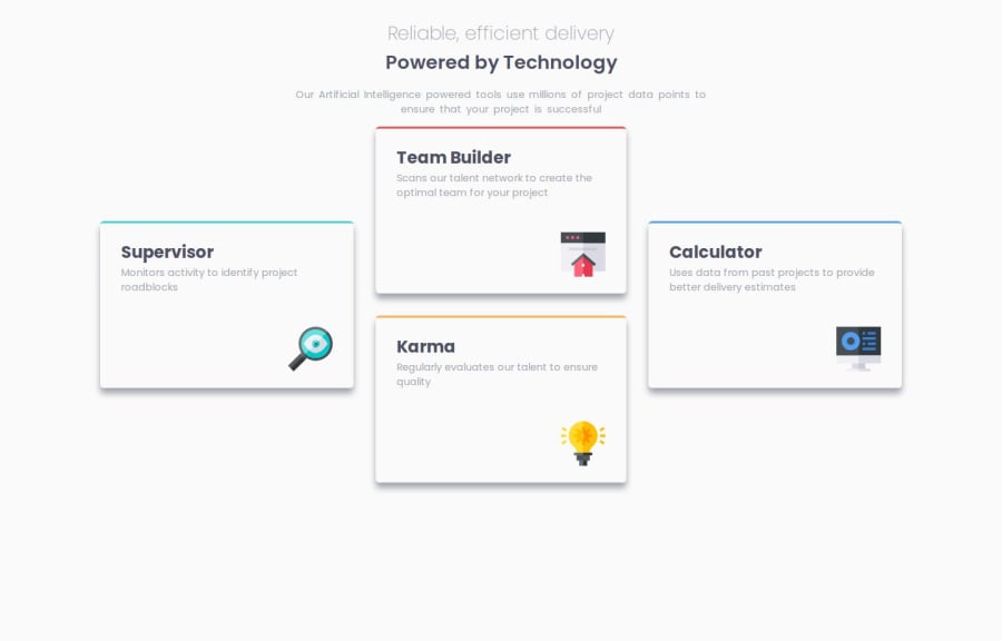


Design comparison
SolutionDesign

Solution retrospective
What challenges did you encounter, and how did you overcome them?
Transitioning from a desktop-first approach to a mobile-first design was somewhat challenging.
Community feedback
- @skyv26Posted 2 months ago
Hi @salahelec2,
👍 Nice job on your project! It’s coming along well. Here’s a quick suggestion to improve the layout:
To ensure that your entire content is centered on the screen, you can add
min-heightto yourbodytag and use flexbox to align everything. Here's a small adjustment:body { margin: 0; padding: 0; display: flex; min-height: 100vh; /* Ensures full screen height */ flex-direction: column; align-items: center; justify-content: center; /* Centers content both vertically and horizontally */ background: var(--very-light-gray); font-size: 15px; font-family: Poppins, sans-serif; }With this setup, your content will always be centered, no matter the screen size. 🎯
Keep up the great work! Can’t wait to see more updates! 🚀
Marked as helpful0

Please log in to post a comment
Log in with GitHub
Join our Discord community
Join thousands of Frontend Mentor community members taking the challenges, sharing resources, helping each other, and chatting about all things front-end!
Join our Discord