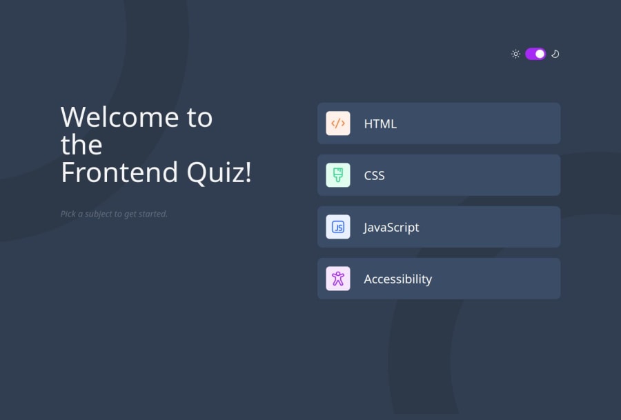
Frontend_Quiz_app_React_Styled-Components_Framer-motion
Design comparison
Solution retrospective
I'm particularly proud of the additional complexity I introduced to this project by challenging myself to avoid using React Router for navigation. Instead, I implemented a sophisticated state management system using the Context API and a reducer function. This approach allowed me to create a conditional rendering system for components based on the application's state, demonstrating my ability to architect complex, production-grade code structures.
The decision to use Context API for global state management, while keeping it local to the UI, showcases my understanding of when to apply different state management solutions. This approach is perfectly suited for managing UI-specific state without the overhead of more complex state management libraries.
I'm also pleased with how I tackled styling the application using Styled Components, especially when it came to dynamically styling components based on different answer behaviors. This required a deep dive into the capabilities of Styled Components and pushed me to expand my skills in creating flexible, reusable styled components.
Another aspect I'm proud of is the implementation of a dark/light mode theme from scratch. By choosing not to rely on a third-party library, I gained valuable experience in creating a theme system. While I acknowledge that my implementation might not be optimal, I remain open to feedback and improvements.
To enhance the user experience beyond the initial challenge requirements, I incorporated animation effects using Framer Motion. This addition, along with the confetti celebration at the end of each quiz, brings a dynamic and visually appealing element to the application.
For future projects, I might consider exploring more efficient ways to implement theming, possibly by researching best practices or leveraging existing libraries while maintaining a deep understanding of the underlying principles.
What challenges did you encounter, and how did you overcome them?One of the main challenges was applying the principles of "Thinking in React" to this project, especially given the additional complexity I introduced. The process involved:
- Breaking the UI into a Component Hierarchy
- Identifying the Minimal Set of App State
- Determining Which Component Owns the State
- Using Props to Flow Data Down the Component Hierarchy
- Adding Interactivity and Handling State Changes
This approach required significant reflection and planning, particularly due to the self-imposed constraints. It was an iterative process that demanded numerous modifications throughout the development cycle. Each step presented its own challenges, from deciding on the optimal component structure to determining the most efficient way to manage and propagate state changes.
Implementing the theme provider for the entire application also presented some difficulties. Ensuring that the theme was consistently applied across all components and that theme changes were smoothly reflected throughout the UI required careful consideration of component structure and state management.
What specific areas of your project would you like help with?I'm particularly interested in receiving feedback on my implementation of the dark/light theme system. If there are more efficient or elegant methodologies for implementing theme switching in React applications, I would be eager to learn about them. I'm always looking to improve my code and adopt best practices, so any insights into optimizing theme management or alternative approaches would be greatly appreciated.
Community feedback
- P@NikitaVologdinPosted 5 months ago
Hi @juliengDev! Great work overall! Your solution: – Contains semantic HTML – Robust accessibility – Layout looks perfect across different screen sizes – Well structured code
According to dark mode, I decided to add a class on the body in the theme-switcher component when dark mode is on and remove it when it is off. My dark mode implementation looks like this:
body.dark
    background-color: variables.$slate-900
    color: white

    .theme-switcher
        &__icon
            svg
                fill: white
    .introduction
        &__title
            color: white
        &__info
            color: variables.$blue

    .options
        &__item
            background-color: variables.$slate-600
            color: white
    .final
        &__title
            color: white
    .score
        background-color: variables.$slate-600
        &__points
            color: white
        &__questions-amount
            color: variables.$blue
0
Please log in to post a comment
Log in with GitHubJoin our Discord community
Join thousands of Frontend Mentor community members taking the challenges, sharing resources, helping each other, and chatting about all things front-end!
Join our Discord
