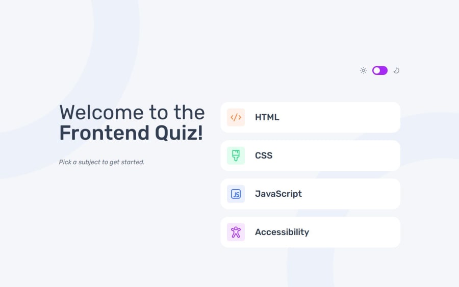
Design comparison
Community feedback
- P@YuliaLantzbergPosted 4 months ago
Hi. Your project is built well. I liked the naming and how js code was written. It's easy to read, the flow is organized simple, and clear. However, I think, the semantics of HTML can be improved. There is no main tag. You can use it instead of the root div. Also you use section as an entire container and then use divs. I think, it would be more reasonable to use a few sections for start, quiz, answers and score as there are separate different groups (pages). Anyway, main is strongly considered as the best practice. And about sections it's only in the scope of personal opinion. Also, there is a small bug. Your progress bar is empty when you enter the first question in the first cycle of the quiz. And start to expand only from the second question. But when you enter the first question after answering other topics, then the progress bar is full on the first question (like it's on 100%) I'd suggest to use the native progress tag of HTML. It'd be more right semantically but also very easy to manipulate. You just give the number of questions as max and change value as a number of the current question. And it will work perfectly. Hope it is helpful. And again, I really liked the simplicity of js code. :-)
0
Please log in to post a comment
Log in with GitHubJoin our Discord community
Join thousands of Frontend Mentor community members taking the challenges, sharing resources, helping each other, and chatting about all things front-end!
Join our Discord
